It’s taken more than a year, but really, I guess it’s taken way longer than that to get to where we are in the status of our kitchen. Today, I’m finally sharing our kitchen makeover reveal! Well, with a few caveats. There’s always a few caveats 😉 (Also, I think I say “finally” in every reveal post.) But, we’ve been enjoying our Agreeable Gray kitchen with white Alabaster walls — transitioned from cream with greige walls — for a little while now and I have lots of opinions. First though, I feel like we need a brief journey back to remember how we got here.
*Posts on KelleyNan.com may contain affiliate links. Click HERE for full disclosure*
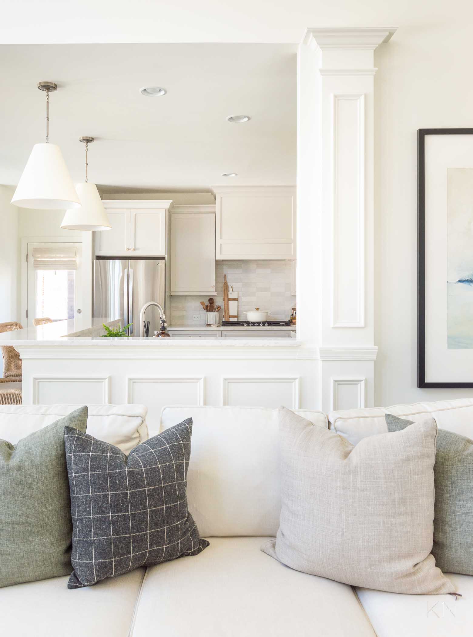
Sources: Pendant Lights | Backsplash Tile | Cabinet Knobs (champagne bronze 1 5/16″) | Dutch Oven (7.25 qt) | Dutch Oven Gold Knob (large) | Counter-Depth Refrigerator | Range Hood Insert | Faucet | Sofa | Belgian Linen Pillows
Why a Kitchen Makeover?
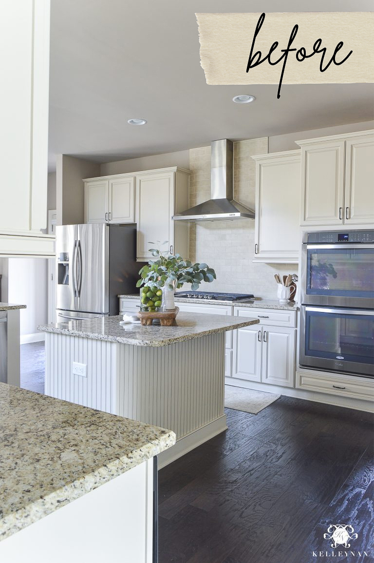
A former history of our kitchen… we started with cream, raised panel cabinets with small(ish) hardware in the pewter(?) family. We had Perfect Greige paint on the walls, dark brown/black speckled granite countertops, and a muddy-beige travertine backsplash. We have no windows in the kitchen so it stays pretty dark with the only natural light filtering across the breakfast nook and into the far side of the kitchen.
Also to note — we have a small kitchen island and the bar is used more… but both are used daily. The kitchen is semi-open and the wall that divides the kitchen and living room is structural. By all accounts, it was a nice kitchen. Also, I didn’t realize how dark it would be before we lived in our house and I wasn’t thrilled with the overall coloring — trying to brighten up the dark and make the cabinets appear less buttercream. Without much natural light, they had a tendency to lean even more yellow, so I tried to keep bright whites away from them.
Fast forward to 2018 (almost five years ago from the time of this post). We decided to make a few updates to make the kitchen a little more current, without giving it an overhaul. We upgraded our countertops to a pretty, subtle quartz, traded our small stainless divided sink for a big stainless single basin, switched our pendant lighting, changed our cabinet hardware to something more sleek, and lightened the paint to Edgecomb Gray — still a greige but lighter. I wanted the kitchen to feel brighter but my primary goal was to still camouflage (while coordinating with) the cabinet color and backsplash. And, I think we achieved that! You can see that reveal after we switched countertops and made several easier cosmetic changes HERE.
We still had one-day-wish-list items but I wasn’t planning that for any time soon. We actually thought we may have moved or may be in the process of moving by now so I didn’t know if more changes would ever happen. But then, 2020 happened, we started on the bathroom project after the flood (see that reveal HERE), and with the crazy housing market (increased home values, insane demand and competition, and costs of building materials), we kind of decided we would likely be staying put and just making our home into what we wanted (with limitations 😉 ). That’s also what drove the decision to proceed with the pool.
Anyway, when we were working on the bathroom and already had someone installing tile, 1. I fell in love with the varying neutral tones of the tile we were using for our shower surround and thought it would go well in the kitchen, and 2. if we were going to update our backsplash, it would be more cost effective to have the tile installer add the kitchen to the project so he could do both spaces together. I wanted a stacked vertical pattern in the shower and asked for a stacked horizontal tile pattern in the kitchen to keep things a little interesting. Well, I was wrong. Not about the tile itself or the pattern. But once the tile was installed in the kitchen, it was alarming how much it clashed with our cream cabinets. I thought that varying neutrals from white and cream to tones of gray would coordinate and tone down the creaminess of the cabinets, but it had the opposite effect. The cabinets officially looked yellow. It wasn’t even a question that had to be considered — we were going to have to change the cabinet color. (Funny enough, after living with it for a couple years, it actually didn’t bother me as much.)
So, that’s the background of how we got to the place of starting a kitchen revamp (Part II) — we didn’t undo anything we’d already done but we did go ahead and expand upon what we initially planned. We’ll go over all the details and “whys” along the way, but let’s go ahead and get to some of the fun stuff!
Kitchen Before & After
With the kitchen getting made over, we went ahead and coordinated the breakfast nook changes at the same time since the two spaces are connected. You can see that before and after and full reveal in THIS post that I just shared this past week. Here’s a look at what the space looks like…
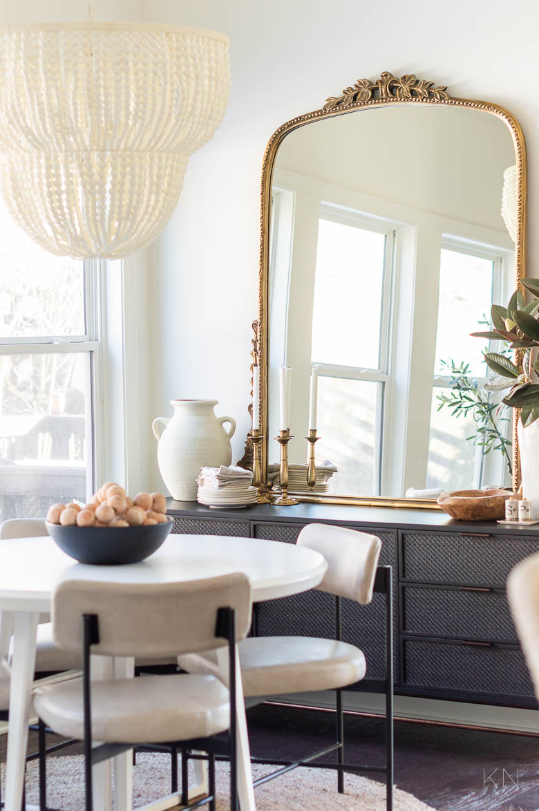
Sources: Wood Bead Chandelier | Dining Table (48′ Diameter) | Dining Chairs (pebble) | Sideboard | Primrose Mirror (gold; 5′) | Round Jute Rug (7 x 7′) | Large Black Bowl | Terracotta Beaded Garland | Salt & Pepper Shaker Set | White Stoneware Vase | Faux Magnolia Branches | Candle Holders (similar)
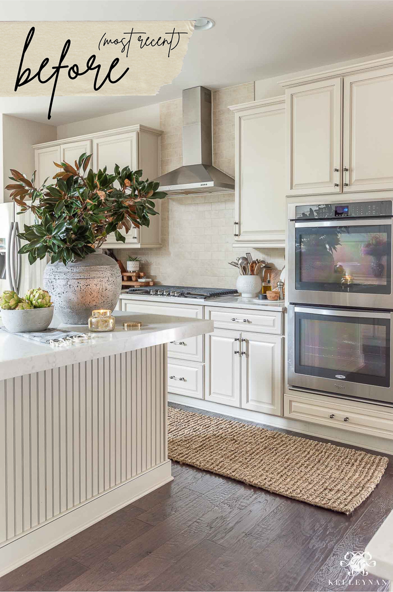
And as for the kitchen and where we started, I thought it would be more fun to share what it looked like, back in 2018, just before the mini revamp (for the sake of a little drama and excitement 😉 ). Here it was…
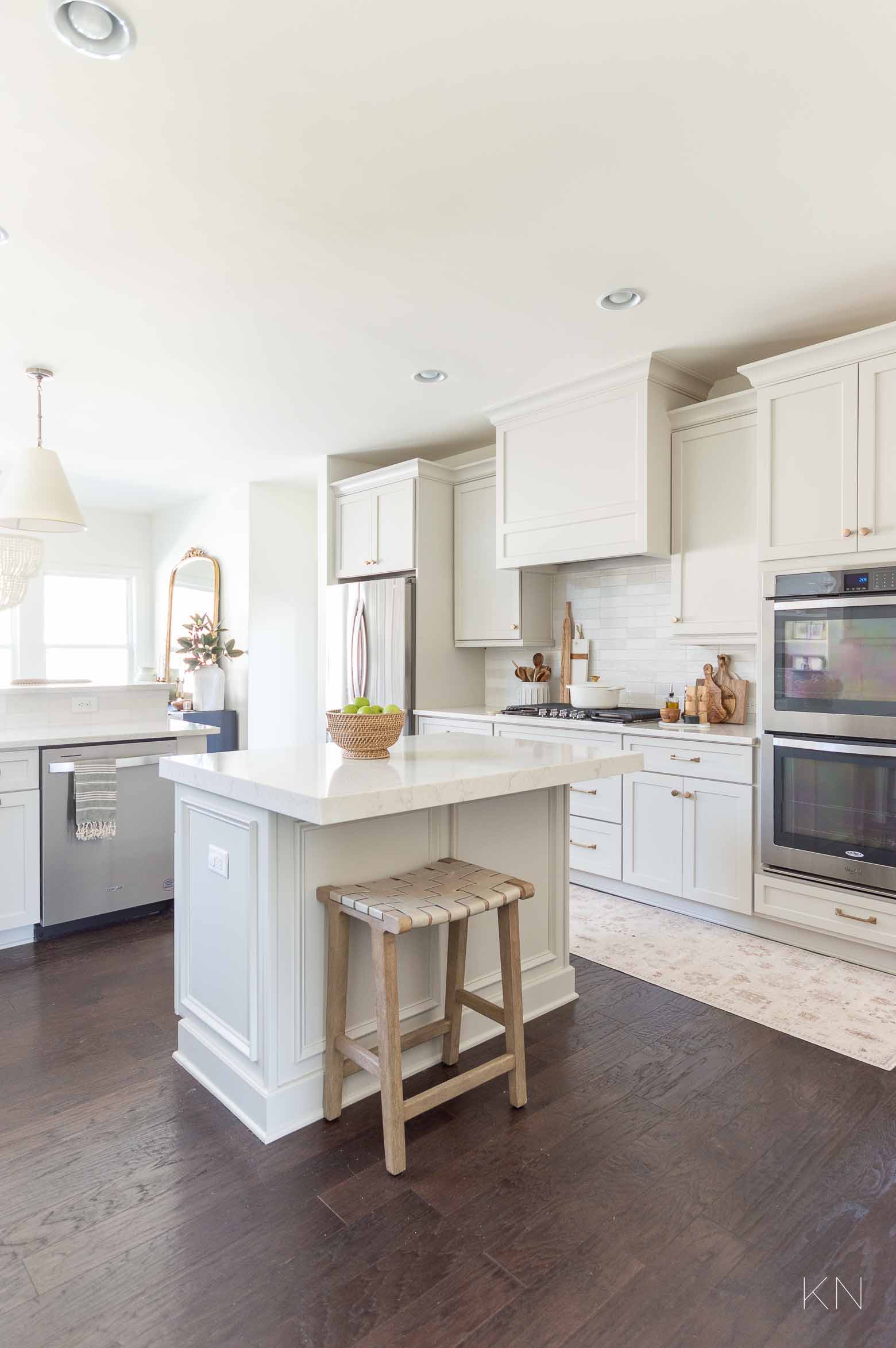
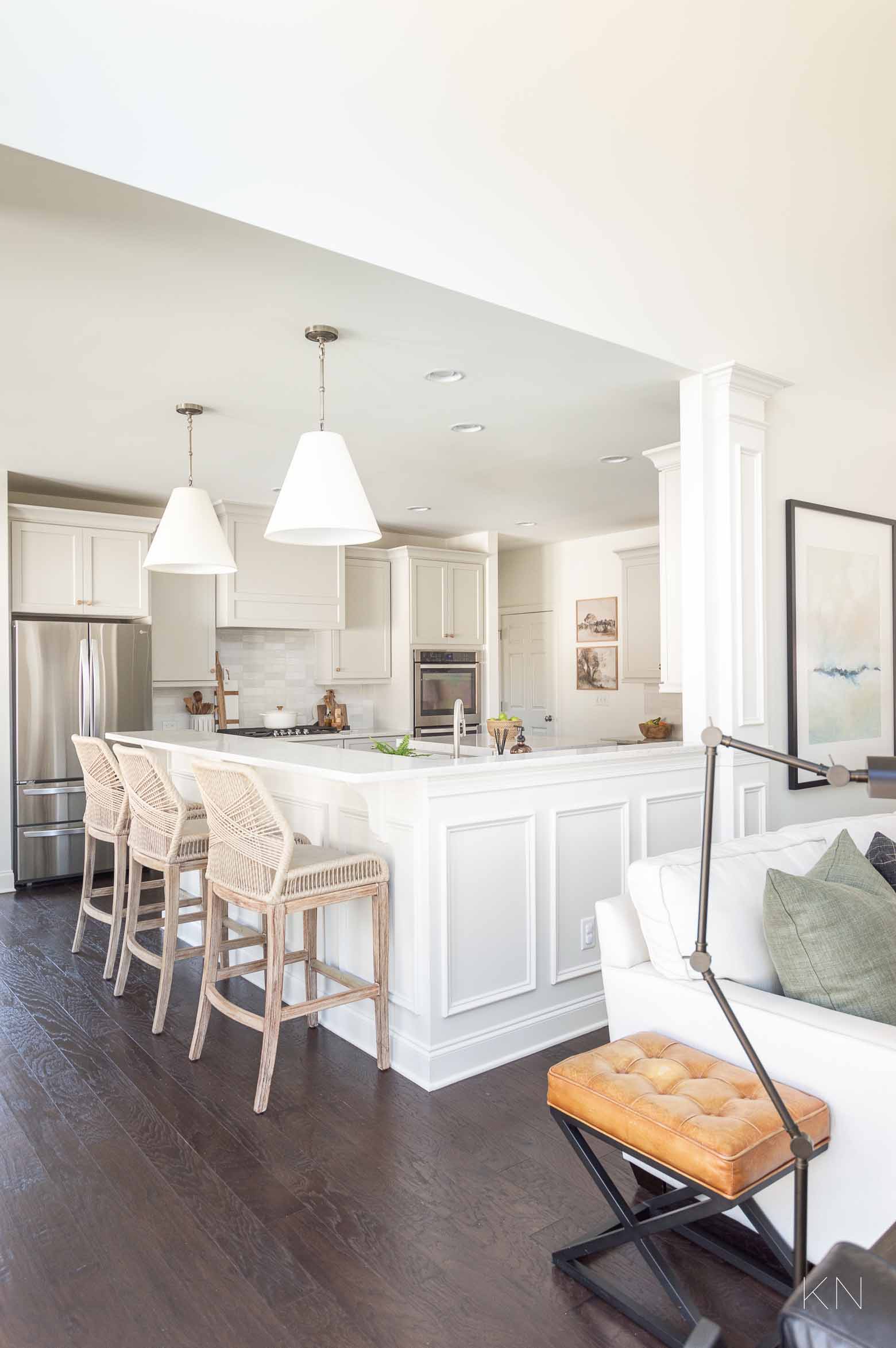
And five years and a series of not-too-complicated-changes, here it is today!
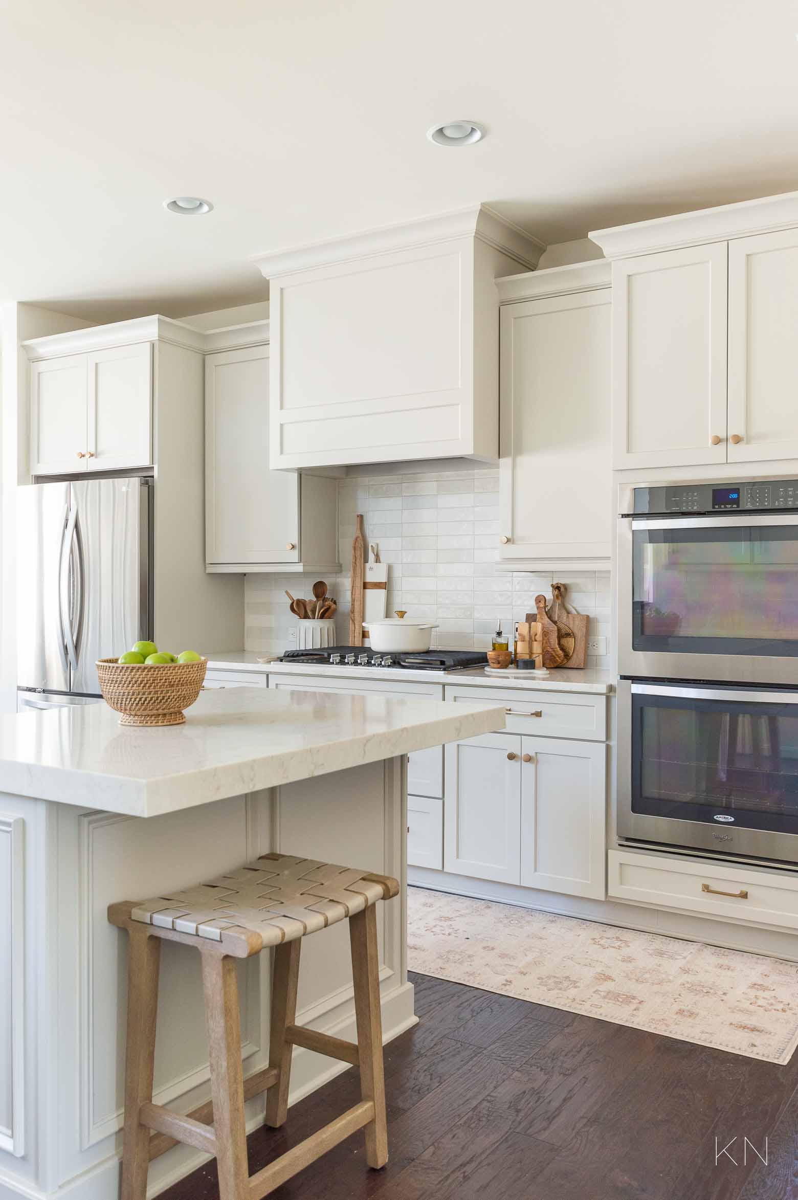
Sources: Woven Leather Backless Counter Stool | Rattan Bowl | Runner (2.5’x10′) | Backsplash Tile | Drawer Pulls (champagne bronze 6 5/16″) | Drawer Pulls (champagne bronze 5 1/16′) | Cabinet Knobs (champagne bronze 1 5/16″) | Dutch Oven (7.25 qt) | Dutch Oven Gold Knob (large) | Textured Spoon Rest | Utensil Crock | White Cheese Board | Olive Wood Cheese Board | Olive Oil Bottle | Olive Wood Salt Keeper | Counter-Depth Refrigerator | Range Hood Insert
I love it. For me, it feels like just the right amount of cozy but clean. It’s lighter but not stark (we’ll talk more about the Agreeable Gray cabinet paint with Alabaster walls just a little later in the post!). It’s got both traditional elements and a few modern characteristics. It’s eclectic but uniform, mixes lots of natural tones and materials, and feels like a working kitchen.
Kitchen Chair/Stool Saga
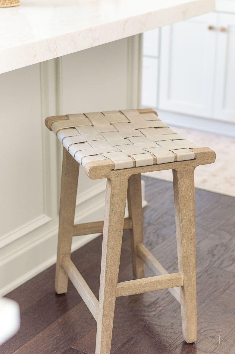
There’s a lot going on here and we’ll address each detail but first — I said there were caveats and the first is that my second counter stool hasn’t arrived yet, haha. It likely won’t be here until around June and I wasn’t going to wait any longer, so you’ll just have to use your imagination for now 😉
Sources: Woven Leather Backless Counter Stool | Rattan Bowl | Runner (2.5’x10′) | Backsplash Tile | Drawer Pulls (champagne bronze 6 5/16″) | Drawer Pulls (champagne bronze 5 1/16′) | Cabinet Knobs (champagne bronze 1 5/16″) | Dutch Oven (7.25 qt) | Dutch Oven Gold Knob (large) | Textured Spoon Rest | Utensil Crock | White Cheese Board | Olive Wood Cheese Board | Olive Oil Bottle | Olive Wood Salt Keeper | Counter-Depth Refrigerator | Range Hood Insert | Tassel Turkish Towel | Pendant Lights | Primrose Mirror
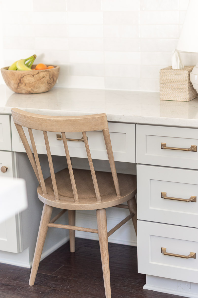
One of the final details in the space was when I realized the black Windsor chair I’d had at the stationery desk for the past several years — and had planned to continue to use — was just too much of a severe contrast for what I was going for. I loved the soft, natural wood finish of THIS chair and it was confirmed when it arrived. It’s such a beautiful color and is really well made and sturdy. But, it clashed with my rattan counter stools that it backed up to — which I also had not planned on changing. When it’s taken this many years to get to here, I didn’t want the entire kitchen we’d invested in to feel thrown off because of clashing chairs/stools. I also didn’t want to spend a lot since this wasn’t a detail I had planned on changing.
Sources: Chair (sea drift) | Tissue Box Cover | Backsplash Tile | Drawer Pulls (champagne bronze 5 1/16′) | Cabinet Knobs (champagne bronze 1 5/16″)
I found THESE backless woven leather stools and loved them — they felt current but classic and I felt they basically encompassed my entire kitchen. So, I decided right then to run up to the PB Outlet, just to see if they had some, knowing they wouldn’t. I was open to multiple leather tones and a couple of wood finishes but by pure luck, they had a stool — in the correct counter height — and it was the same sea drift wood as the desk chair and was the same Pebble leather as our breakfast nook chairs. What are the chances?! The only thing that would have made it better is if they had had two. I got a really good deal on that stool and didn’t have to pay shipping. But, I did have to order the second one from the website HERE and with long lead times, it won’t be here for a while. But, I can wait. I’m thrilled I was able to save on at least one of them. (If I hadn’t found the one I had at the Outlet, I actually would have gone a little darker on the leather for just a littler more contrast and warmth.)
Sources: Woven Leather Backless Counter Stool
The Kitchen Paint Colors — Arriving at Agreeable Gray by Sherwin Williams for Our Cabinet Paint
Now that we’ve side-barred to address that elephant in the room, let’s talk about the biggest kitchen difference — the paint colors.
Sources: Backsplash Tile | Drawer Pulls (champagne bronze 6 5/16″) | Drawer Pulls (champagne bronze 5 1/16′) | Cabinet Knobs (champagne bronze 1 5/16″) | Dutch Oven (7.25 qt) | Dutch Oven Gold Knob (large) | Textured Spoon Rest | Utensil Crock | White Cheese Board | Olive Wood Cheese Board | Olive Oil Mister | Olive Oil Bottle | Olive Wood Salt Keeper | Range Hood Insert
I was in the middle of wanting lighter but warm and I didn’t want white cabinets. Since we were keeping our cabinets and relying on paint, wood tones were out. I also didn’t want a color I may tire of. So, instead of going white on the cabinets, I decided we’d go white on the walls — in Alabaster by Sherwin Williams to match the living room/primary paint color of our house these days, and most importantly, some sort of mushroom/taupe/greige that wasn’t too dark for the cabinets. Ultimately, I decided on Agreeable Gray by Sherwin Williams. Again, I determined that color almost two years ago and today, I’m still glad we went that route. Kitchen trends are always changing but I love that our kitchen is as airy as it can be, while still feeling homey and the wooden accessories I’ve collected over the years adds a little bit of earthiness and authenticity.
Again, the position of our kitchen, lack of lighting, etc. really affects the shades of paint. A lot of people think Alabaster reads too yellow in their homes. For ours, I think it’s perfect. I also used it for the trim, doors, and ceiling (definitely no stark whites against it). The marriage of our multi-tonal Cloe white tile with soft Agreeable Gray cabinets and our creamy Soprano quartz countertops makes me want to cry. Literally. It’s amazing that I chose each at varying stages of the process, over the course of several years, and how beautifully they came together.
Had I relied on internet photos or paint chips to determine the cabinet paint color, I definitely wouldn’t have considered Agreeable Gray. It looks dark and kind of muddy. More brown that what I wanted. In person, in our home, in our kitchen, with our light and our surroundings, it was exactly what I was looking for.
As for the Alabaster wall paint in the kitchen, our kitchen is shadowy so the white paint stays pretty shadow-y — still a little paler than the cabinets, though. I really like the effect.
While I went with a gold/brass hardware (I love the warm golden tones against the warm greige!), I think polished nickel would also be fabulous. I think it would be too much maintenance in the kitchen for me (more maintenance than chrome and has to be polished), but if you’re considering Agreeable Gray for a bathroom, I’d be all over it. I used polished nickel in our bathroom (see our bathroom HERE), and I love it.
Kitchen Upgrades and Changes
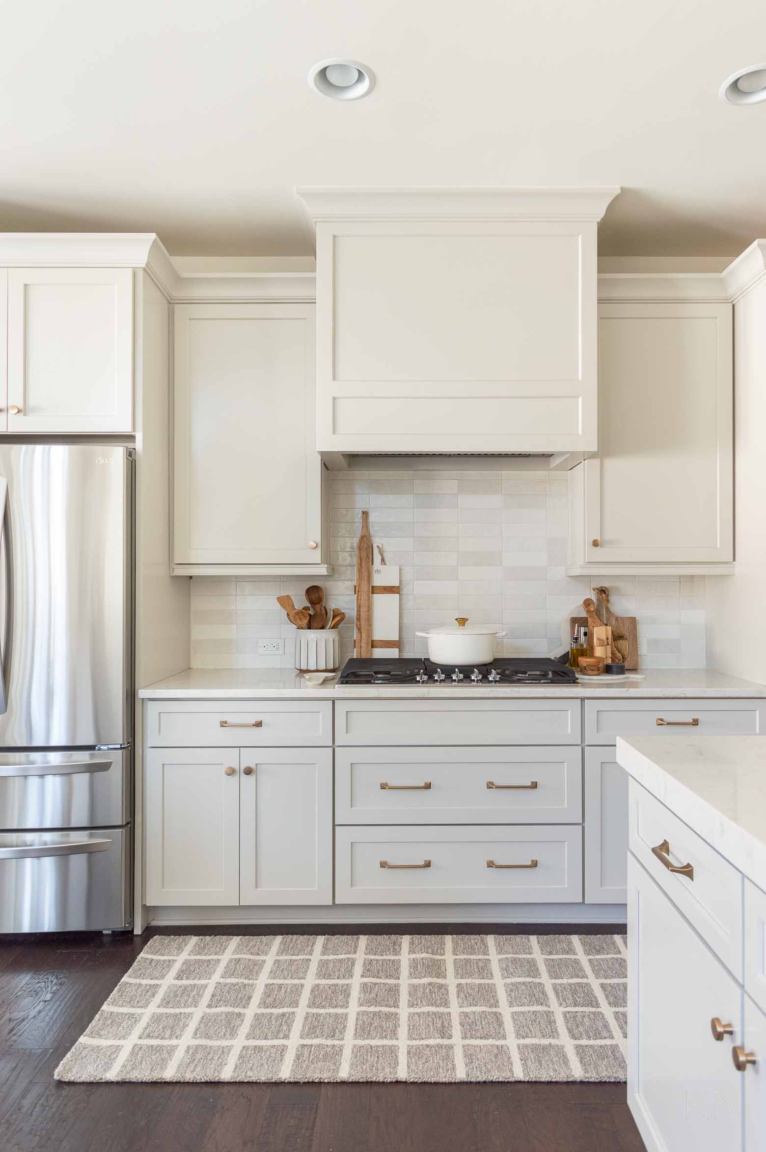
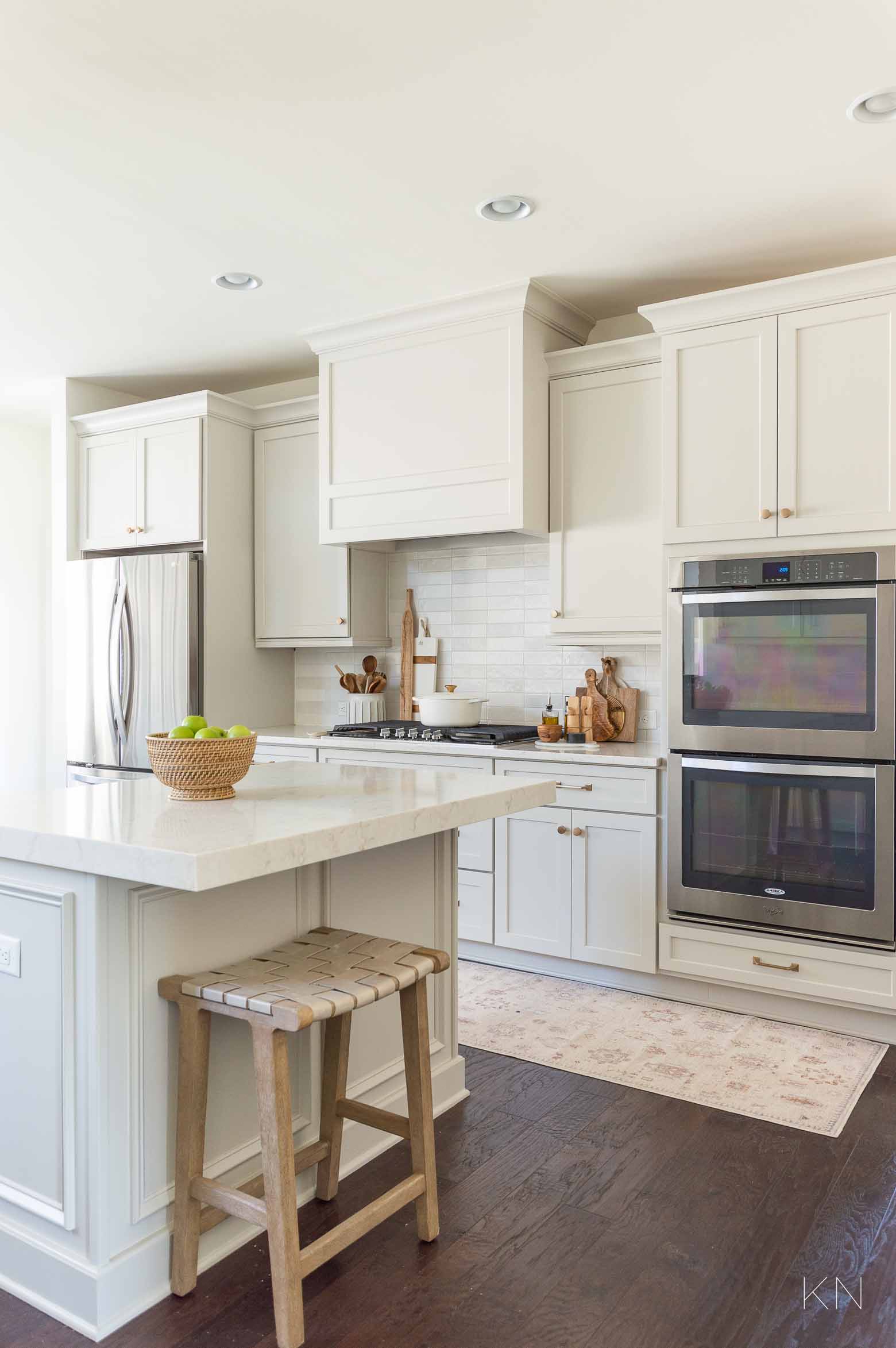
Now, let’s talk about more labor intensive changes. The kitchen backsplash was actually finished about a year and a half ago. It took almost a year to get the kitchen cabinet crew in — I’m not going to talk too much about that 😉 When we first met about painting the kitchen cabinets, we found out that it wouldn’t be that much more to replace the doors. Since some of our doors had hairline cracks and were the raised panel design, we went ahead and opted for new shaker style doors. (New cabinets were never on the table, nor did we need them). I asked the cabinet crew if they could come up with something that was more of a graduated/angled shaker panel so the square was just a little less harsh and liked what they came up with.
Along with the new doors, we also updated the thin traditional upper cabinet molding to a larger cove crown molding. We have really tall ceilings in the kitchen and for a moment, I had considered trying to come up with some sort of design and materials to make the cabinets connect with the ceiling. Our cabinets are already 48″ and require a ladder to get beyond the second shelf. Upper cabinets would have been too small for my liking (I hate tiny upper cabinets) and would have been more costly. Ultimately, I thought there was too much of a gap between the top of the cabinets and the ceiling for it not to look silly and again, the costs to come up with something would have added up. I don’t regret the decision to just leave it at beefier, simple molding.
Even though we were keeping our cabinet boxes in tact, I did ask about the possibility of transforming our refrigerator space to have a surround, for a more built-in look. This was actually an upgrade we didn’t opt for when building and I’ve always regretted it. They were able to do that pretty easily and just bumped out the upper cabinet and added a side piece. That was one of the best “while-you’re-doing-that-go-ahead-and-do-this” decisions we made. Also, for the first time, I can actually access the cabinet and use it! It also added more dimension to the wall of cabinetry.
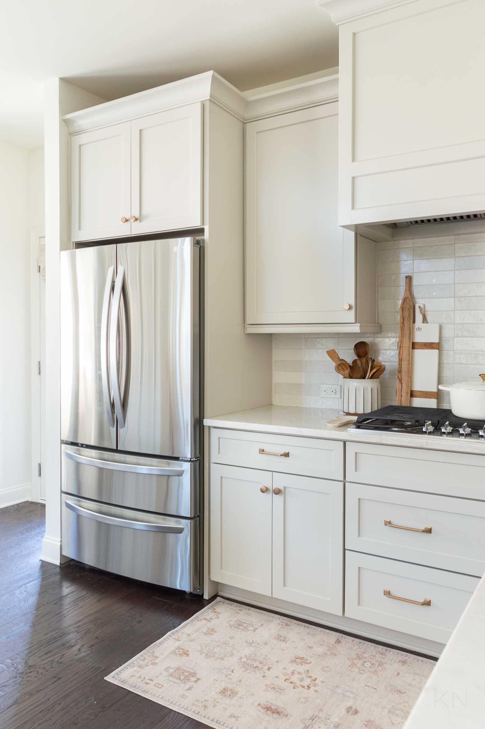
Sources: Runner (2.5’x10′)| Backsplash Tile | Drawer Pulls (champagne bronze 6 5/16″) | Drawer Pulls (champagne bronze 5 1/16′) | Cabinet Knobs (champagne bronze 1 5/16″) | Dutch Oven (7.25 qt) | Dutch Oven Gold Knob (large) | Textured Spoon Rest | Utensil Crock | White Cheese Board | Counter-Depth Refrigerator | Range Hood Insert
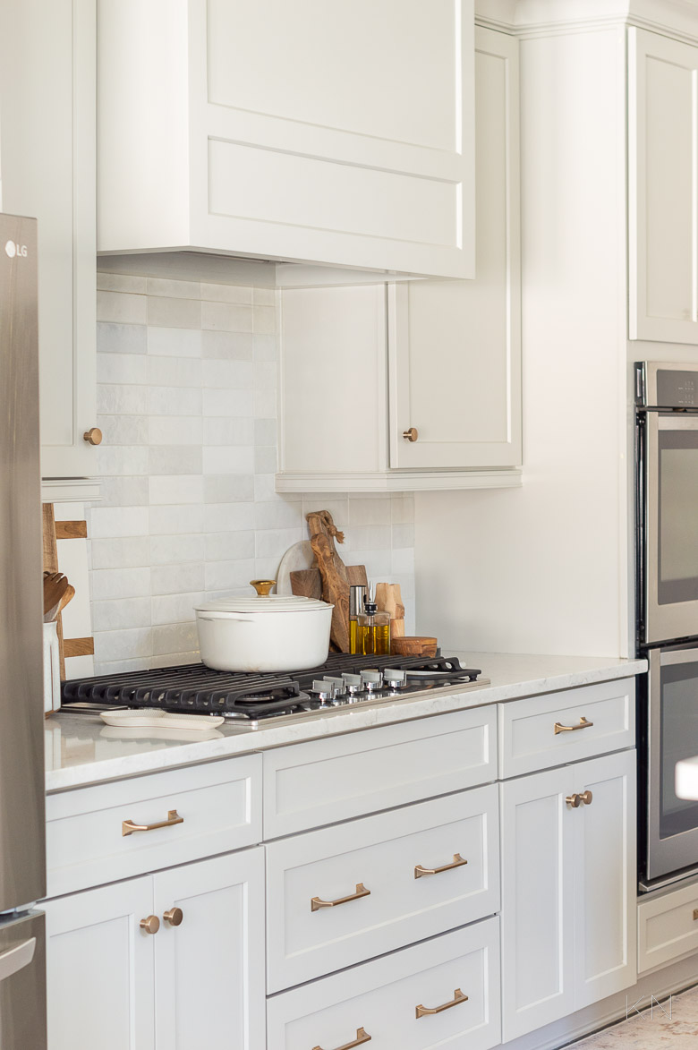
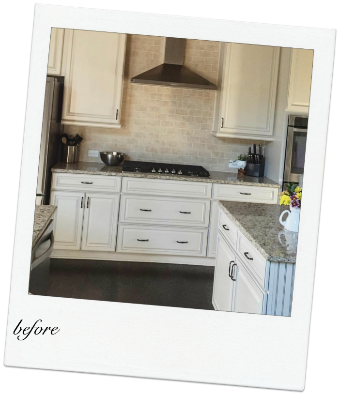
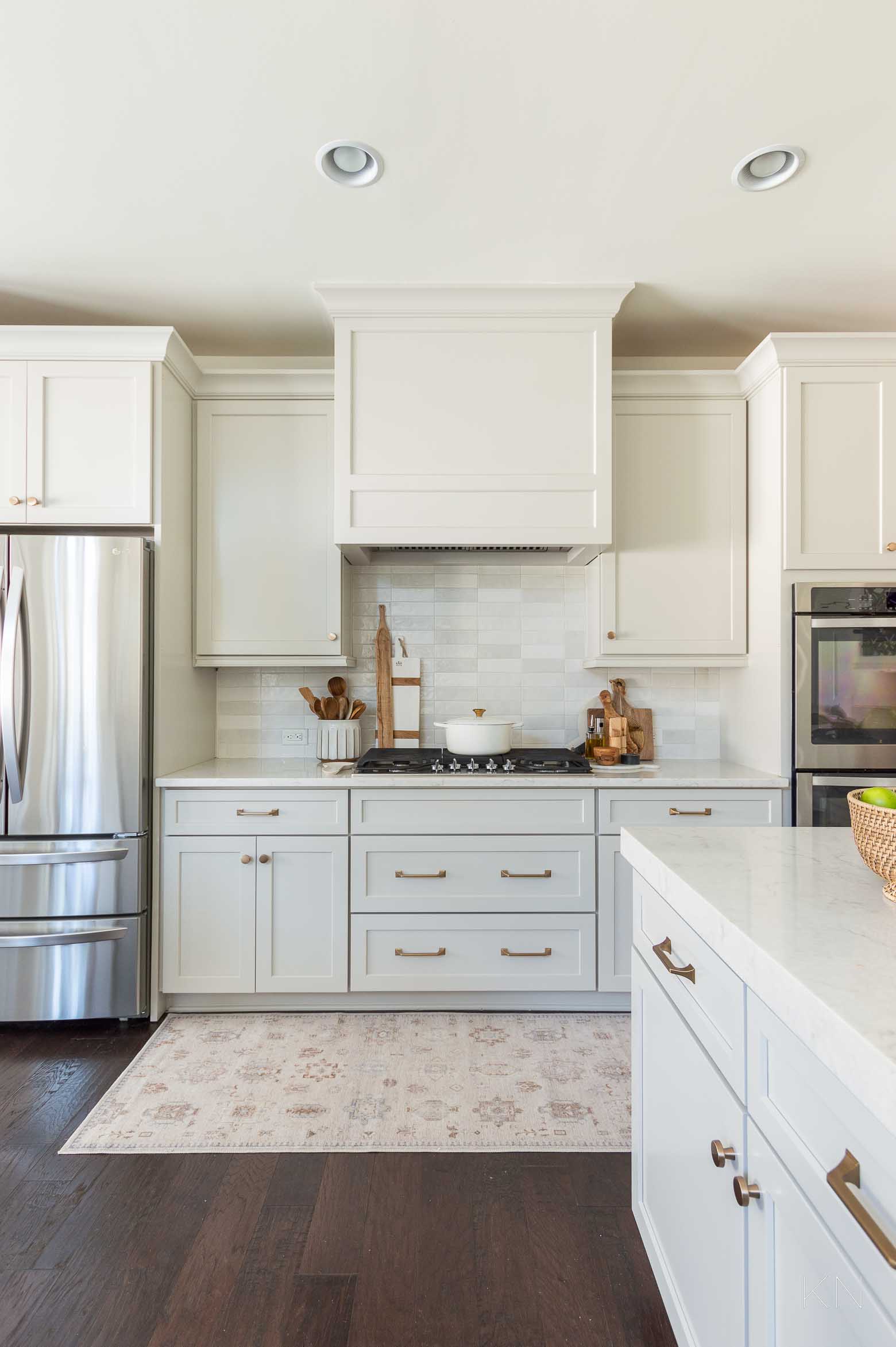
The decision I’m probably most happy with though, in terms of adding custom details, was the custom vent hood cover to beef up the cooktop area and to coordinate with our cabinets. Here was the before (this was probably closer to eight years ago)…
And this is what it looks like now!
Sources: Runner (2.5’x10′) | Backsplash Tile | Drawer Pulls (champagne bronze 6 5/16″) | Drawer Pulls (champagne bronze 5 1/16′) | Cabinet Knobs (champagne bronze 1 5/16″) | Dutch Oven (7.25 qt) | Dutch Oven Gold Knob (large) | Textured Spoon Rest | Utensil Crock | White Cheese Board | Olive Wood Cheese Board | Olive Oil Bottle | Olive Wood Salt Keeper | Counter-Depth Refrigerator | Range Hood Insert
For a kitchen that was only built with builder-limited upgrades, it really makes the kitchen feel way more custom. I wanted something clean, not fussy, and since we weren’t changing the cabinet boxes, there wasn’t any room for trim or an apron to wrap arond the sides since the cabinet doors would overlap. I’m really happy with the double-box design I ultimately went with but this was actually attempt #2. We aren’t going back to that place and time, though 😉
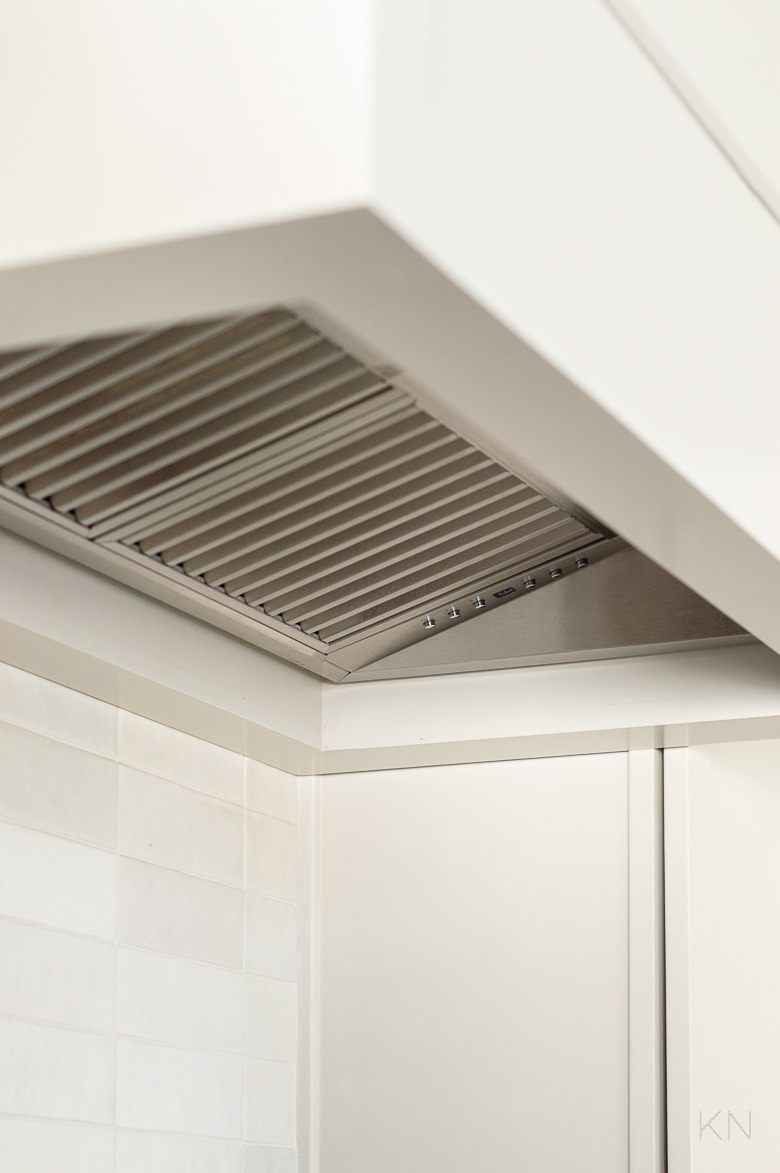
I also envisioned a substantial vent insert with (in my mind) more of an industrial feel. We cook daily and use our kitchen heavily. Ours is the ducted 34″ version HERE. If you’re taking a similar route, surely you won’t have an issue but I learned something in a frustrating way. Hopefully, the people who are building your hood communicate with the people installing the insert and each person knows who’s doing what and when. Again, I won’t go into specifics but there were some nightmarish situations and drama with several of the areas in the kitchen, but the hood was the most ridiculous.
Sources: Range Hood Insert
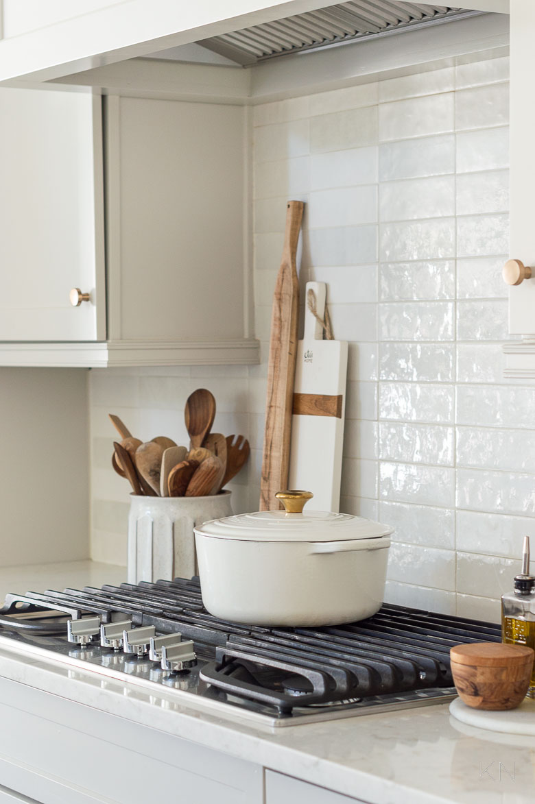
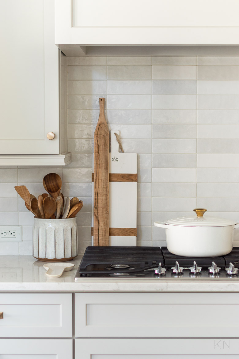
Peep that pretty gold Le Creuset Dutch oven knob my mom gifted me for Christmas — it was easy to switch to from the standard silver stainless and it matches my hardware beautifully! You can find other finishes in three sizes on Amazon HERE.
Sources: Backsplash Tile | Cabinet Knobs (champagne bronze 1 5/16″) | Dutch Oven (7.25 qt) | Dutch Oven Gold Knob (large) | Utensil Crock | White Cheese Board | Olive Oil Bottle | Olive Wood Salt Keeper | Range Hood Insert
Choosing a Kitchen Runner
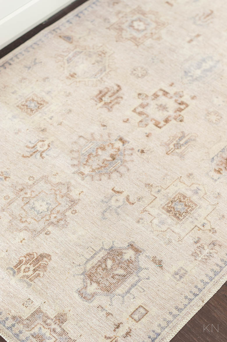
I was stoked to find THIS runner and I found it by total accident. I loved THIS runner from Serena and Lily but it was far beyond what I wanted to spend for something going in front of a cooktop. When I was looking for something similar, I found what ultimately became mine (HERE). There’s a bunch of different sizes (mine is the 10′ runner version) but the price was so good (plus, it ships free), I was skeptical. It’s awesome for the kitchen. Not only is it washable (I haven’t washed it yet as it’s stayed clean for the past month or so I’ve had it out), but it also has a non-slip back. It’s thin and just as the disclaimer says in the package, the wrinkles fall out within a few days.
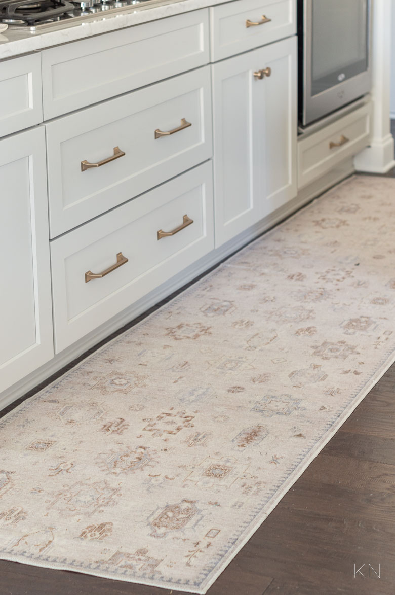
Sources: Runner (2.5’x10′) | Drawer Pulls (champagne bronze 6 5/16″) | Drawer Pulls (champagne bronze 5 1/16′) | Cabinet Knobs (champagne bronze 1 5/16″)
It has both warm and cool tones with browns beiges and grays — just what I was hoping for.
Sources: Runner (2.5’x10′)
And the art I chose goes with it so well. By the time I got around to personalizing the kitchen, I didn’t want to spend more. I found these prints (HERE), and (HERE) from a small Etsy shop and downloaded them for $3. The shop owner provides every size you could need and then you just download the appropriate size for which you’re framing. I sent them to mpix for printing (as I do with all my photos), and then ordered THIS oak frame off Amazon. There’s lots of sizes and four wood finish options — mine are the 16″x20″ in Natural.
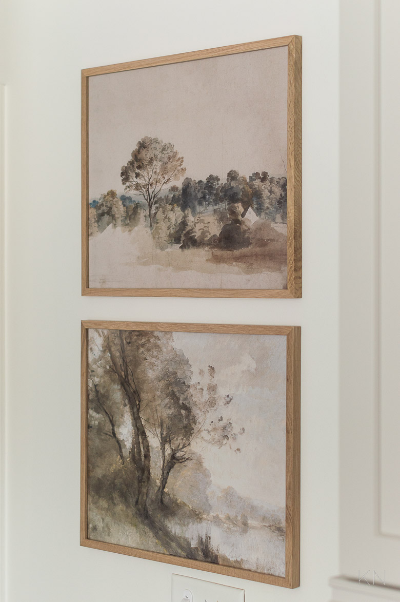
Sources: Top Print | Bottom Print | Print Frames
I had actually ordered a back-up runner, just in case, with a grid pattern I really liked but I *think* I prefer the former for now.
Sources: Runner | Backsplash Tile | Drawer Pulls (champagne bronze 6 5/16″) | Drawer Pulls (champagne bronze 5 1/16′) | Cabinet Knobs (champagne bronze 1 5/16″) | Dutch Oven (7.25 qt) | Dutch Oven Gold Knob (large) | Textured Spoon Rest | Utensil Crock | White Cheese Board | Olive Wood Cheese Board | Olive Oil Bottle | Olive Wood Salt Keeper | Counter-Depth Refrigerator | Range Hood Insert
Here’s a little closeup of my Cloe tile (in the white variation)… Again, we’ve had this tile so long now, we actually need to go back and re-caulk where the tile meets the countertops. I’m still trying to find a place for my big boards (that I LOVE SO MUCH) as the kitchen changes prohibit countertop space now…
Sources: Backsplash Tile (white) | Cabinet Knobs (champagne bronze 1 5/16″) | Dutch Oven (7.25 qt) | Dutch Oven Gold Knob (large) | Textured Spoon Rest | Utensil Crock | White Cheese Board
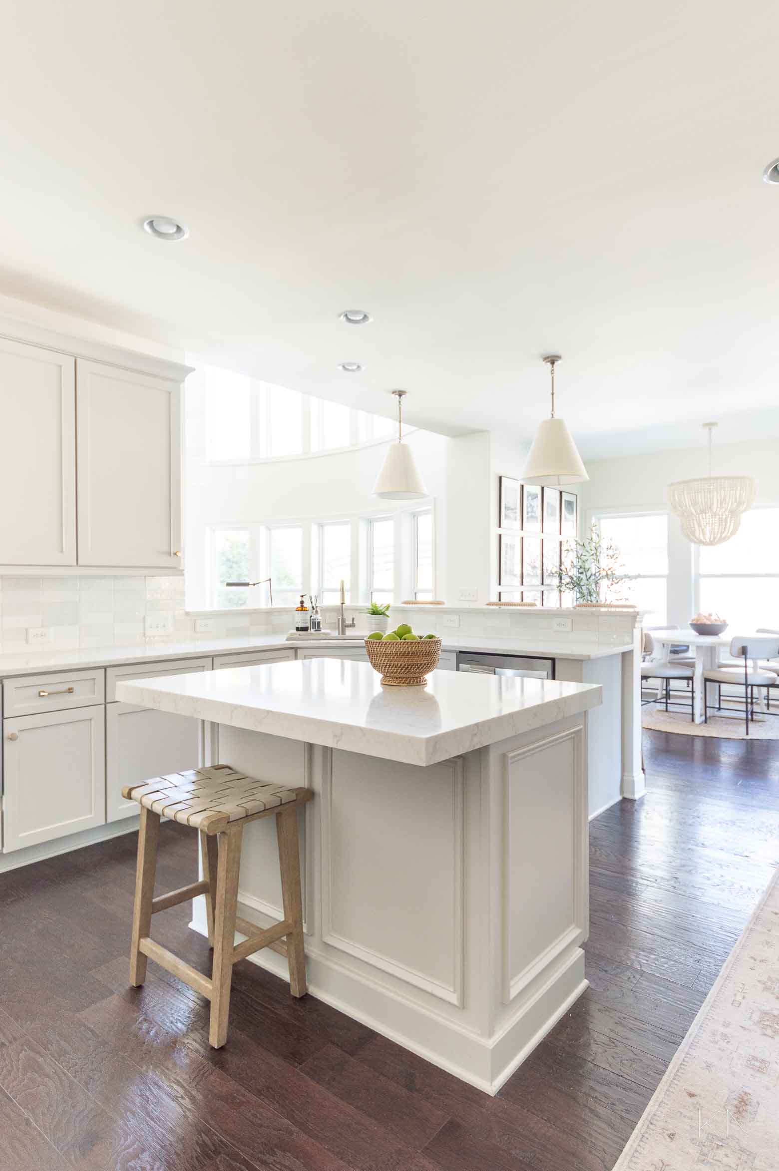
We removed the bead board from the kitchen island and instead of mimicking the cabinet fronts, I opted for picture frame molding to tie into the other molding we have around. I wish we had asked them to add the same picture frame molding to the sides of the cabinets — you can see one just beyond the island to the right…
Sources: Runner (2.5’x10′) | Pendant Lights | Woven Leather Backless Counter Stool | Rattan Bowl | Backsplash Tile | Drawer Pulls (champagne bronze 5 1/16′) | Cabinet Knobs (champagne bronze 1 5/16″) | Faucet | Pendant Lights | Wood Bead Chandelier | Dining Table (48′ Diameter) | Dining Chairs (pebble) | Round Jute Rug (7 x 7′) | Large Black Bowl | Terracotta Beaded Garland
I still can’t decide if I’m glad to have the raised bar or not. Ideally, I would have loved to have dropped the bar to counter height when we installed the countertops several years ago, but that would put the counter basically IN the living room. It would actually put the kitchen sink almost in the living room. So, while I typically prefer the look of counter-height bars without split surfaces, I think for our kitchen, it’s the right call.
Sources: Backsplash Tile | Drawer Pulls (champagne bronze 5 1/16′) | Cabinet Knobs (champagne bronze 1 5/16″) | Faucet | Pendant Lights | Wood Bead Chandelier | Tassel Turkish Towel
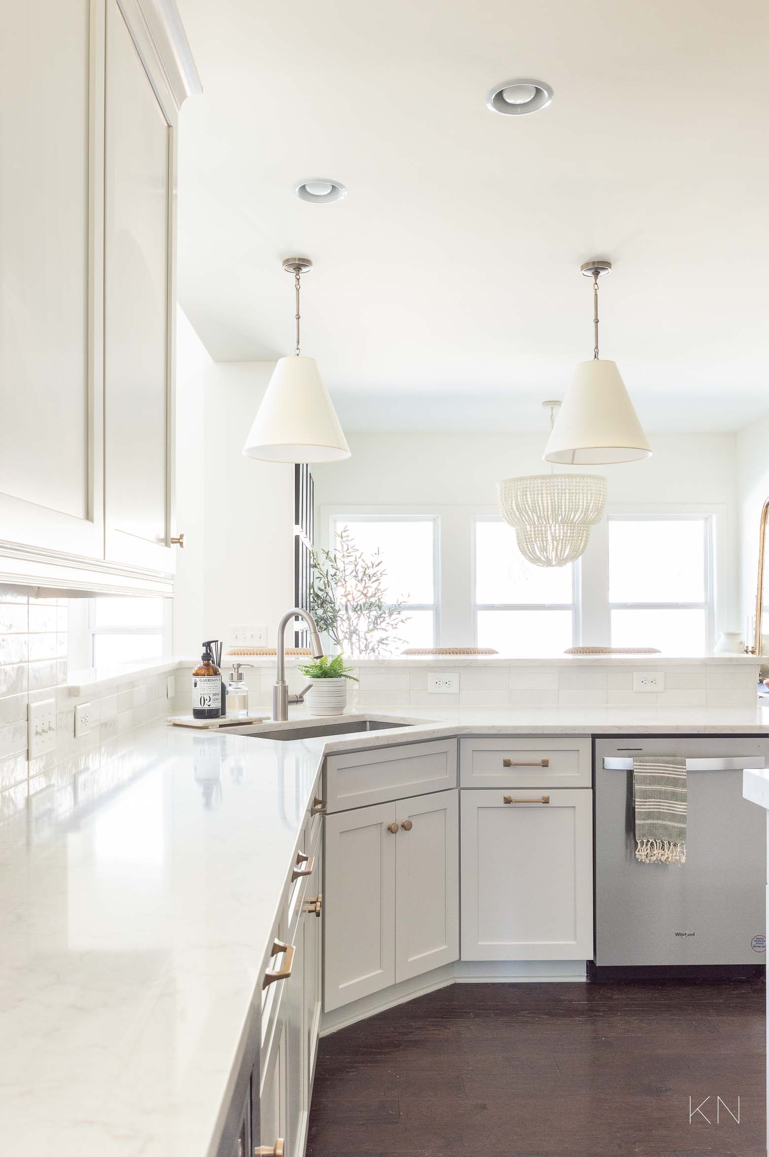
That sink right there — with a single basin — is one of the best decisions we ever made for the functionality of our kitchen.
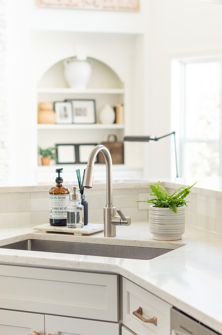
Sources: Backsplash Tile | Drawer Pulls (champagne bronze 5 1/16′) | Cabinet Knobs (champagne bronze 1 5/16″) | Faucet | Foaming Soap Dispenser | Marble Tray (similar) | Plant Pot
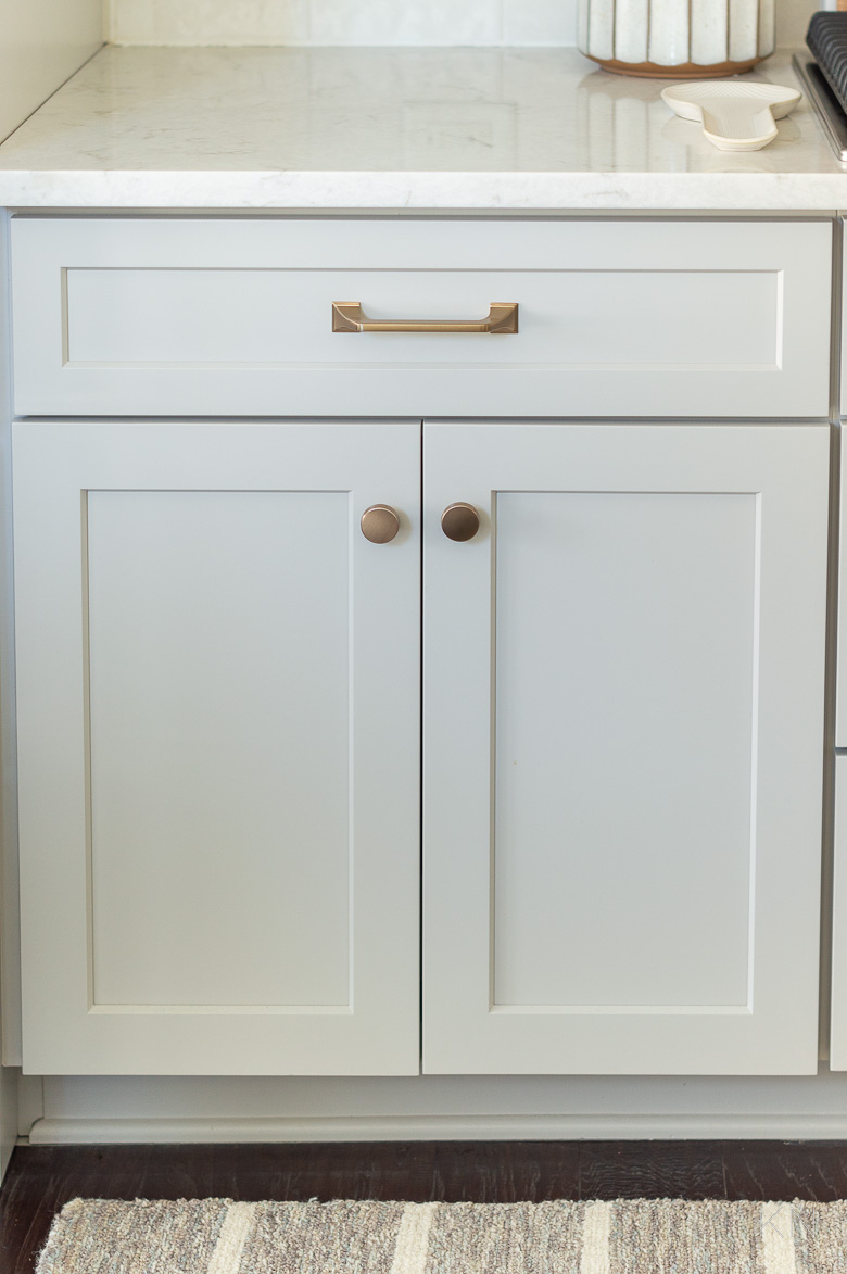
Deciding On The Cabinet Hardware
I know from experience that cabinet hardware — the style, size, color, material — can change the entire feel of your kitchen. I knew a few things going into it…
- I wanted it to be fairly substantial
- I wanted the style to be transitional — nothing leaning too contemporary or traditional
- Since the cabinet paint was going to be Agreeable Gray by Sherwin Williams — a warm gray/greige — I wanted to lean into it a bit more with gold or brass, or contrast it a bit with black
- I wanted to mix to hardware styles together — knobs, pulls, library pulls, cup pulls, etc.
Sources: Drawer Pulls (champagne bronze 5 1/16′) | Cabinet Knobs (champagne bronze 1 5/16″) | Textured Spoon Rest
I’ve used Amerock hardware in all my important projects and appreciate their quality and heft — especially in such a heavily used space like a kitchen — so I started with them for samples and quickly landed on the style that was just what I was looking for… Exceed pulls (a handsome, clean design with enough subtle curves and lines to soften it — a true transitional piece), and Blackrock knobs (sleek and hefty ). (See all their collections with all the options and colors HERE). But, I still couldn’t decide on black or champagne bronze — the perfect warm matte gold finish. Ultimately, I decided that with some of the kitchen’s other characteristics, the black may lean a little too farmhouse and I settled on the champagne bronze finish, c/o Amerock. I adore them. Yes, the look great but they’re weighty, too — and I think they make the cabinets look more expensive.
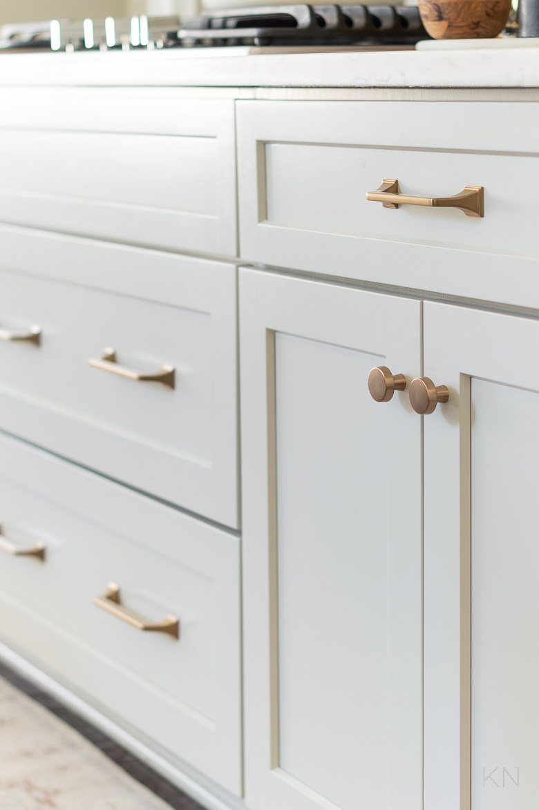
Sources: Drawer Pulls (champagne bronze 6 5/16″) | Drawer Pulls (champagne bronze 5 1/16′) | Cabinet Knobs (champagne bronze 1 5/16″)
I opted for the Exceed drawer pulls in 5-1/16in(128mm) for most drawers and 6-5/16in(160mm) for the pots and pans drawers below the cooktop, and the Blackrock knobs in 1-5/16in(33mm) for all the cabinets. I love that the knobs have a little bit of a tapered girth at the base — as do the pulls, for that matter.
Sources: Runner (2.5’x10′) | Top Print | Bottom Print | Print Frames | Backsplash Tile | Drawer Pulls (champagne bronze 6 5/16″) | Drawer Pulls (champagne bronze 5 1/16′) | Cabinet Knobs (champagne bronze 1 5/16″) | Dutch Oven (7.25 qt) | Dutch Oven Gold Knob (large) | Textured Spoon Rest | Utensil Crock | White Cheese Board | Olive Wood Cheese Board | Olive Oil Bottle | Olive Wood Salt Keeper | Counter-Depth Refrigerator | Range Hood Insert
Minimal(ish) Kitchen Countertops
I’ll be sharing a post soon that addresses this more specifically, but I was so proud that I was able to pare my countertops down even more minimally. They feel so spacious and clean and I love that there’s still warmth in the kitchen without maxing out my clutter threshold.
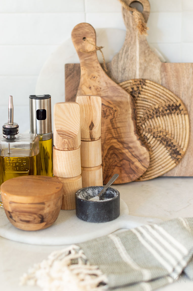
Sources: Olive Wood Cheese Board | Olive Oil Mister | Olive Oil Bottle | Olive Wood Salt Keeper | Tassel Hand Towel
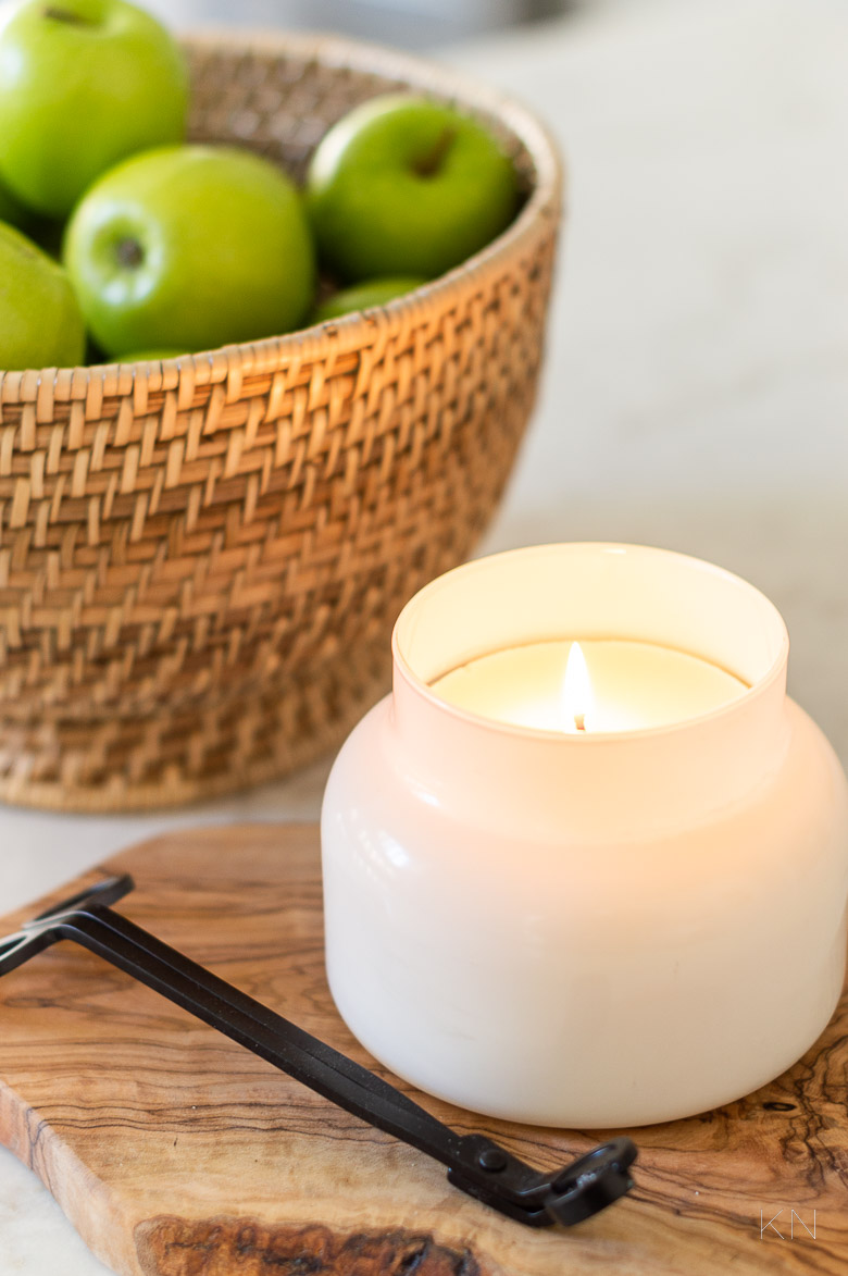
Sources: Rattan Bowl | Olive Wood Cheese Board | Candle | Candle Wick Trimmer
There are still things I want out and easily accessible but I’ve made major strides and taken pretty significant efforts to get more things tucked away (and still available). I love olive wood in a kitchen and have collected a lot over the years. I had to force myself to restrain a little bit because while I use most of this daily, I could have kept going!
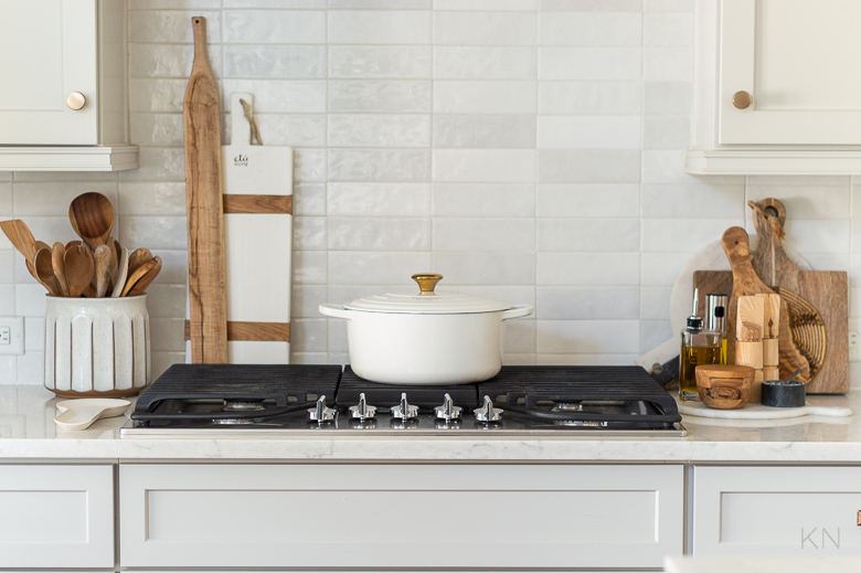
Sources: Backsplash Tile | Cabinet Knobs (champagne bronze 1 5/16″) | Dutch Oven (7.25 qt) | Dutch Oven Gold Knob (large) | Textured Spoon Rest | Utensil Crock | White Cheese Board | Olive Wood Cheese Board | Olive Oil Mister | Olive Oil Bottle | Olive Wood Salt Keeper | Range Hood Insert
The two appliances I keep out always…
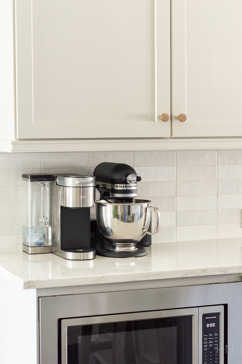
Sources: Backsplash Tile | Cabinet Knobs (champagne bronze 1 5/16″) | Kitchen Aid Mixer
The kitchen is tough to photograph since the light is so uneven and there’s lots of shadows, but you can see our living room Alabaster walls, that now layer against our Alabaster kitchen walls, with Agreeable Gray kitchen cabinets on top. IF I were switching my pendant lights, I probably would have done something with a brass/gold chain to tie in to the hardware, but I still love the pendants I’ve had there for the past several years. Because they are antique nickel finish, I think they go right along with the stainless. But, and again — totally hypothetical — if I chose new fixtures now, even if I went with the same style pendants, I would probably opt for the linen shade and hand-rubbed antique brass finish. You can configure that option HERE.
Sources: Woven Bar Stools | Pendant Lights | Top Print | Bottom Print | Print Frames | Rattan Bowl | Backsplash Tile | Drawer Pulls (champagne bronze 6 5/16″) | Drawer Pulls (champagne bronze 5 1/16′) | Cabinet Knobs (champagne bronze 1 5/16″) | Dutch Oven (7.25 qt) | Dutch Oven Gold Knob (large) | Utensil Crock | White Cheese Board | Olive Wood Cheese Board | Olive Oil Bottle | Olive Wood Salt Keeper | Counter-Depth Refrigerator | Faucet
Even though our kitchen has gotten a pretty heavy dose of updates, the overall tone has stayed pretty true to where we started. We still have a goal of soft, warm, and lived in — just a cleaner version. One more look back from a few years ago (with quartz countertops)…
Sources: Jute Runner | Cabinet Pulls | Large Stoneware Vase
And where we are today.
Sources: Runner (2.5’x10′) | Woven Leather Backless Counter Stool | Rattan Bowl | Backsplash Tile | Drawer Pulls (champagne bronze 6 5/16″) | Drawer Pulls (champagne bronze 5 1/16′) | Cabinet Knobs (champagne bronze 1 5/16″) | Dutch Oven (7.25 qt) | Dutch Oven Gold Knob (large) | Textured Spoon Rest | Utensil Crock | White Cheese Board | Olive Wood Cheese Board | Olive Oil Bottle | Olive Wood Salt Keeper | Counter-Depth Refrigerator | Range Hood Insert
We still have some tweaking to do to get the soft close cabinets and drawers just right and some small touch-ups need to be made but we are so enjoying our light gray updated kitchen! I have more posts coming soon with some on my minimalism journey as it relates to the kitchen, organization updates, and more. For all that, plus more project and space reveals, be sure to subscribe to emails at the bottom of the post.
SOURCES & DETAILS
Paint Colors: Walls – Alabaster (Sherwin Williams) | Ceiling – Alabaster (Sherwin Williams) | Cabinets – Agreeable Gray (Sherwin Williams)Hard Surfaces: Counter tops- LG Viatera quartz in 3″ Soprano (with mitered edge island) | Blanco Quatrus 33″ Sink | Faucet (Spot Resistant Stainless)| Backsplash Tile: Cloe 2.5″ x 8″ White | Cabinet Hardware c/o Amerock — Drawer Pulls (champagne bronze 6 5/16″) | Drawer Pulls — Pots & Pans (champagne bronze 5 1/16′) | Cabinet Knobs (champagne bronze 1 5/16″) | Flooring: Nottaway Hickory in Weathered Saddle (5″ planks)
Appliances: Counter-Depth Refrigerator | Range Hood Insert | Kitchen Aid Mixer
Lighting: Pendant Lights (medium, paper shade, antique nickel finish) | Wood Bead Chandelier
Furniture: Woven Bar Stools | Woven Leather Backless Counter Stool (sea drift; Pebble leather) | Secretary Desk Chair (sea drift)
Walls/Art/Windows: Cordless Shades (Bali White) | Top Landscape Print | Bottom Landscape Print | Landscape Print Frames | Primrose Mirror (gold; 5′)
Kitchen Accessories: Runner (2.5’x10′) | Rattan Bowl | Olive Wood Cheese Board | Candle | Candle Wick Trimmer | Dutch Oven (7.25 qt) | Dutch Oven Gold Knob (large) | Textured Spoon Rest | Utensil Crock | White Cheese Board | Olive Wood Cheese Board | Olive Oil Mister | Olive Oil Bottle | Olive Wood Salt Keeper | Foaming Soap Dispenser | Marble Tray (similar) | Plant Pot| Tassel Turkish Towel | Tissue Box Cover
Breakfast Nook Decor: Wood Bead Chandelier | Dining Table (48′ Diameter) | Dining Chairs (pebble) | Sideboard | Primrose Mirror (gold; 5′) | Round Jute Rug (7 x 7′) | Large Black Bowl | Terracotta Beaded Garland | Salt & Pepper Shaker Set | White Stoneware Vase | Faux Magnolia Branches | Candle Holders (similar)


Your kitchen is just beautiful! Love the before and before and after.
Thank you for taking the time to visit, Cassie. I appreciate your kind comment so much!
Beautiful! Did you paint agreeable grey at full percentage or at a lighter percentage?
Thanks, Taryn! The cabinets were painted Agreeable Gray at the full percentage.
Kitchen is absolutely stunning. Magazine worthy! Love your blog. You’re so inspiring.
Gina, You are the sweetest. Thank you for visiting!
Thank you for the detailed explanation! Your kitchen looks great! We are thinking Agreeable gray for our cabinets and we are trying to decide on wall color and faucet finish. Thought about Sherwin Williams pure white but I like the Alabaster warmth more. We like Champagne bronze for cabinet hardware as well, but thought about brushed nickel for the faucet but didn’t know if they had to match. I like the look of it separate like you have!
Thank you for visiting, Ben, and for taking the time to leave a note. Designing a kitchen is so hard and I wish you the best in the process. I am happy to know this post was helpful to you!
You pulled it off, beautiful updates, also love the new nook area.
Thank you for taking the time to stop by and visit the posts, Trudy. I really appreciate your kind comments!
This is my favorite kitchen since I’ve been viewing ideas for months! It is so beautiful and I’d like to mimic the color palette.
We have GE white cafe appliances with the bronze handles and I was wondering if you think it would it work?
Thank you for the information, photos, and links. What a detailed and helpful post!
Tamie, thank you so much. I would go step by step and try to find hardware that goes with your appliance handles (I love that line, btw!), but the color scheme would 100% go well with the cabinets, walls, and countertops! See if you can grab a sample of each to get them all together in real life next to your handles!
Thank you so much for your response which sealed the deal for our color scheme that will go with our café white appliances. We’re going to use it all, including countertops, cabinet color, backsplash, and some of the beautiful accessories. Thank you!
AWESOME! Best of luck to you and wishes for a FUN process with as little stress as possible. It will be worth it!
Hi there again! Thanks for your reply to my last question. I have another for you if you don’t mind!
We are following this look as much as we can in our kitchen Reno. We just put in a white oak island and we’re trying to select a stain for it. Would you have any recommendations with this look in mind?
Hi Braden, This is a tough question to answer without knowing the amount of light and your preferences. If you are undecided, I would recommended trying a couple of sample stains in complementing and contrasting colors to see what you like. Enjoy your kitchen renovation!
Everything looks beautiful! So many decisions but you did a very good job!
Sally, Thank you so much! As detailed in the post, it seemed that one decision made then went to a new decision to determine. I am so happy “she” is done!
WOW! Just wow! Kelly the kitchen is stunning. All of the renovations and makeovers you’ve done have all been amazing.
You’ve knocked them out of the park!
💖💖💖
You are the sweetest, Vanessa. Thank you so much for taking the time to read and for your kind comments!
STUNNING! Tbh I actually loved your older (most recent) kitchen a lot and couldn’t believe you re-did it again…..but I can see why you are extremely happy with this big change.
Well done,ma’am!
Hi Michele, This one has been in the works for a while! Thank you for visiting and for taking the time to comment.
Kelley,
You did a FANTASTIC job with your kitchen makeover, not only the space itself, but with the blog post. Everything is linked and explained so perfectly! I LOVE it! 😊
Thank you, Ann, for taking the tie to visit. I appreciate your sweet note very much!
Your kitchen is just beautiful. Forgive me if I missed it somewhere but please tell about your counters. Thank you.
Thank you, Anne! We updated the kitchen counters several years ago, along with some other changes. Here’s a link to that makeover post, along with the details on the counter tops.
https://kelleynan.com/cream-kitchen-update-modern-transitional/
Hi Kelly!
I love following you and your ideas and solutions. I, too, am refacing my cabinets. I am torn between a cream or white. Many think that white cabinetry looks :dirty: against a cream wall. Is that why you did the opposite? And your backsplash. Ahhhhhh! My floors are very similar to yours. Thank you in advance.
Galina
Galina, Thank you for taking the time to stop by and for following along with us! When I changed to the white backsplash, I knew I needed to change the cabinet color since the original cream color looked yellow in my kitchen’s light. The new cabinet color is Agreeable Gray and I think it goes so well with the varying tones in the white backsplash. As the last touch, the walls and ceiling were painted Alabaster, which really lightened up the space since we don’t have a lot of natural lighting in the kitchen. Lighting is everything when it comes to paint color and I lived with some different color samples for a couple of days so I could gauge how the color would look in my space. I wish you the best as you choose your new cabinet color!
Hi! This Reno looks amazing! I love that tile and plan to use it in my Reno as well! What color grout did you use? Trying to get a good blend so it minimizes the grout lines. Looks like you were able to get that!! Thanks!
Kristen, Thank you for taking the time to stop by and for your kind note. I used a basic white grout and also used the same in our primary bathroom. Here’s a link to that, as I used the same white Cloe tile in the shower. I hope you have a fun reno!
https://kelleynan.com/primary-bathroom-remodel/
Such a beautiful kitchen! How has the finish on your knobs and handles worn? I have some oil rubbed bronze pulls that the finish has worn off to expose the brass below. I am loving the champagne bronze finish you used, but I am concerned about its longevity. I appreciate your insight.
Thank you, Lisa, for taking the time to visit! The quality of the pulls is fantastic and we’ve used that brand throughout our house and have never had any wear. They are really substantial!
An absolutely gorgeous kitchen! Every little touch is perfect! Did you use Agreeable Gray at 100%? It seems so much lighter and brighter than other pictures I have seen of it and I just love it!!
Thank you for taking the time to stop by, Beth, and for your kind note! I used the Agreeable Gray at 100% and still am in love with the result. I can say that the amount of natural light you have in a room makes a big difference in the paint color. I also “lived” with a couple of different paint sample colors taped to the cabinets in different areas before I made my final paint color decision.
What a beautiful kitchen. You did so well!! This post has been so helpful. Are you baseboards also alabaster or what white did you use? I’m also curious to know what direction your home faces. I love all the natural light. hope to hear back from you!
Thank you for taking the time to stop by and for your kind note! Yes, the baseboards are also Alabaster. Our house faces south, so most of the light is coming in from the windows on the northern side of the house. Adding the retaining wall and pool in our backyard also allows for more light in the house.
Hi there. We love this look and we’re trying to implement most of it in our kitchen remodel. Can you tell me what type/stain of wood floors you have?
Thank you for taking the time to stop by and for your note. The color of the flooring is Nottaway Hickory in Weathered Saddle. I believe it came from Shaw Floors.
Hi Kelley!! I’ve been following your kitchen reno for years, and just love how it has come together! Gorgeous!! I do have a question though: you said you love how your quartz, backsplash, and cabinets all came together, even though they were all chosen at separate times. If you were able to pick them at the same time, would you still have the Soprano quartz with the Cloe tile? Thank you!!
Krista, Thank you for following along with us and I appreciate your kind note so much! I love the Soprano quartz and Cloe tile and would definitely pick them both again. The neutral tones blend together perfectly. I’ve also been very pleased with the durability of the countertops.
Hi there! I just came across your post because I am trying to pick a paint color for our kitchen cabinets. Like you, we’ve also redone our kitchen piece by piece- our walls are painted alabaster, we also have purchased the cloe tile & I am finalizing our new cabinet color this week. I was looking for a creamy paint color with grey/beige undertones, when I found your post. I was wondering if you had pictures of your kitchen in evening lighting? Thank you so much. This post has been so helpful!
Hi Lissa, Thank you for taking the time to stop by and I am happy to know this post was helpful to you. I am sorry, but I don’t have any pictures of my kitchen with evening lighting. It was helpful to me to hang paint samples on my cabinets to view them at different times of the day as the lighting changed. I wish you the best in finalizing your kitchen redo!
Love your kitchen make over!! What is the brand of doors that you chose and then painted?? Thank you
Wanda, thank you! They actually were just provided by the kitchen company I used so I’m not sure :/