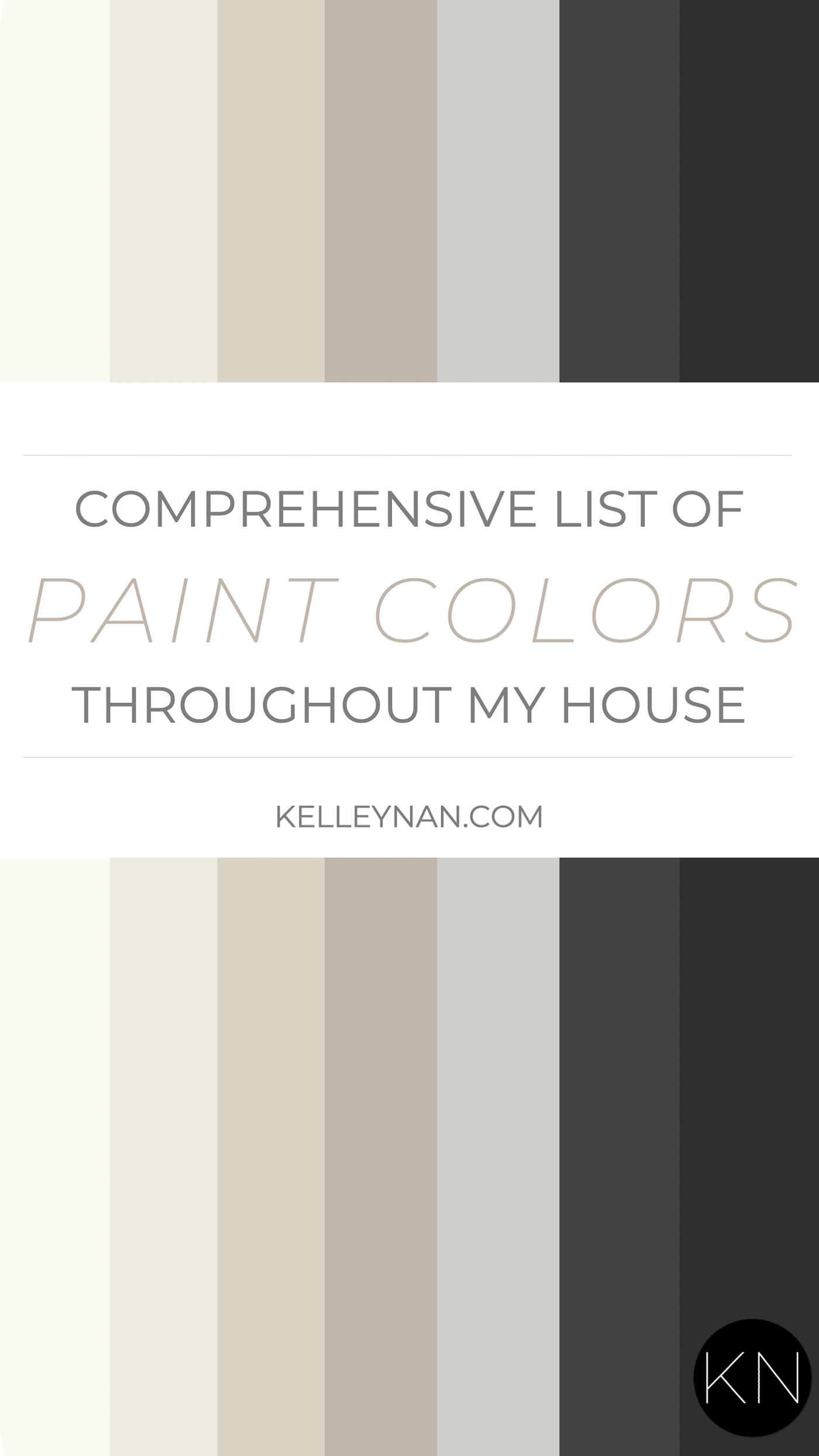
With my number one question (by a landslide) of “what color paint did you use?”, this post has long been one of my most frequented posts. Long overdue, I’ve finally updated the colors in each rom throughout our house — I think we’ve had somewhere around six makeovers and changes since my last update! I try to always add room colors at the bottom of home tours and keep the information available on my room source pages, but with new readers (or regular readers who may have missed it), I wanted to come up with a resource of all the colors, together, along with my honest thoughts after having lived with most of them for three years. Spoiler… I’m not crazy about all of them. So, here it is, friends! From soft whites like Sherwin Williams Alabaster and Benjamin Moore Simply White, to warm neutrals like Benjamin Moore Edgecomb Gray to even more recent dark, charcoal and black paint like Sherwin Williams Tricorn Black and Sherwin Williams Iron Ore — the comprehensive list of interior paint colors throughout my home.
*Posts on KelleyNan.com may contain affiliate links. Click HERE for full disclosure.
When we were building our home, I made too many mistakes by “just wanting it all done” before we moved in. I basically wanted to move into a fully furnished, entirely painted-the-way-I-wanted-it home in less than 24 hours. I shopped ahead of time (and made mistakes), I prioritized some things while not prioritizing others (and made mistakes), and I paid too much for our builder to paint rooms (and made mistakes). I can preach it now (and don’t laugh) but I picked out all of our original paint colors in about 15 minutes from paint swatches. PAINT SWATCHES! Little bitty index split index cards with about as much accuracy as… well… I don’t know what haha. And as you go through the post, you will see just why that’s a bad idea — most of the time, the result is far from what a little paint chip/computer screen will show. I lucked out with my hasty decisions in some areas but others, I had a pit in my stomach as I saw the paint going up. Will I do it differently next time? YES. Since then, I have slowly changed rooms over time but not before investing in multiple samples and testing against light, different times of day, different parts of the room, etc. Before we jump right in, here are a few things to keep in mind.
CAVEATS, LESSONS, & TIPS
- The paint finish can vary the shade/color of the paint. Simply White in matte finish can look different than Simply White in a glossy finish.
- Do not rely on a paint swatch (or even worse, your computer screen) to choose a paint color. You’ll see how different they look throughout the post in real life versus an on-screen swatch.
- Paint colors will look different (darker/lighter), with different tones (warmer/cooler/different undertones) as the light changes. Example — my breakfast nook looks totally different in the indirect morning light vs. the late afternoon direct light. At night, it looks about 50 shades darker (no pun intended 😉 ). My great room paint looks several shades lighter/darker in one line of sight, just because some areas are more shadowy/further from the window.
- Colors in your home may look different than the same colors in someone else’s home. Light isn’t the only thing that will change the way a room looks; furnishings, decor and even what’s going on outside can make a room look brighter/darker or vibrant/dull.
- Photography can alter how a room appears in real life. You’ve probably noticed that content creators/photographers have their own photo style. Some are dark and moody, some are light and airy… exposure, shadows, contrast, etc. can affect the brightness and tones of colors. I try to edit my pictures accurately to what I see in real life but undoubtedly, there will likely be some variance from time to time. Moral of the story- don’t rush out and buy 10 gallons of paint based on a photo you saw online.
Ok, now that I’ve gotten all that out of the way, I’ll take you through each color in my home – where it appears and how I feel about them.
Sherwin Williams Creamy
(Where is it? Trim throughout most of the house; built-ins)
With the exception of rooms we’ve since made over in their entirety, Sherwin Williams Creamy (SW 7012) is the trim color throughout most our house. It’s a beautiful, warm white, especially against darker colors, BUT, if you put it up against a stark/bright white, it will look yellow(ish). A lot of people use it on cabinets; here, you can really tell what it looks like against on our built-ins against our greige walls, in a semi-gloss finish…
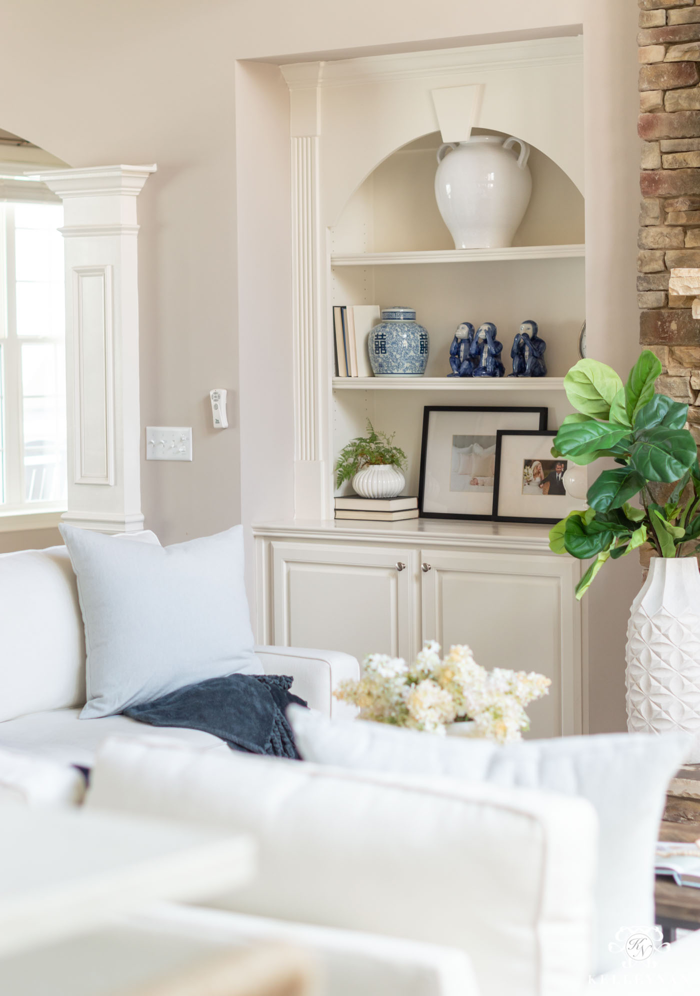
Sources: Urn | Blue & White Lidded Jar | Fiddle Leaf Fig Stems | Sofas (Linen Performance Fabric) | Pillow | Throw | Faux Hyacinth Stems
and here it is in a satin finish on the built-ins in my office.
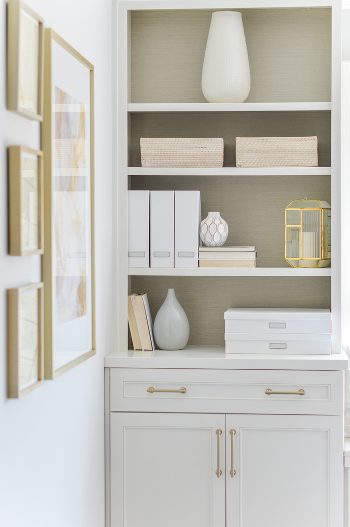
Sources: Cabinet & Drawer Pulls | Document Boxes | Gray Vase | Magazine Files | White Wash Baskets | Large Art | Small Art
Since painting a few other rooms in the house, having such a warm white has actually been a little bit of a hinderance. In rooms where I went white, I ended up having to paint all the trim and doors so they wouldn’t look darker/more yellow than the room color and in some of our larger rooms, it’s actually prohibited me from pulling the trigger because it’s such a big commitment to repaint all the baseboards and crown. If you love warm colors and greiges, it looks great. But, if you change your mind often and are considering white walls, I would maybe go with something a little more pure whites (like one of my still-warm but more white whites that I’ll share further down — Benjamin Moore Simply White).
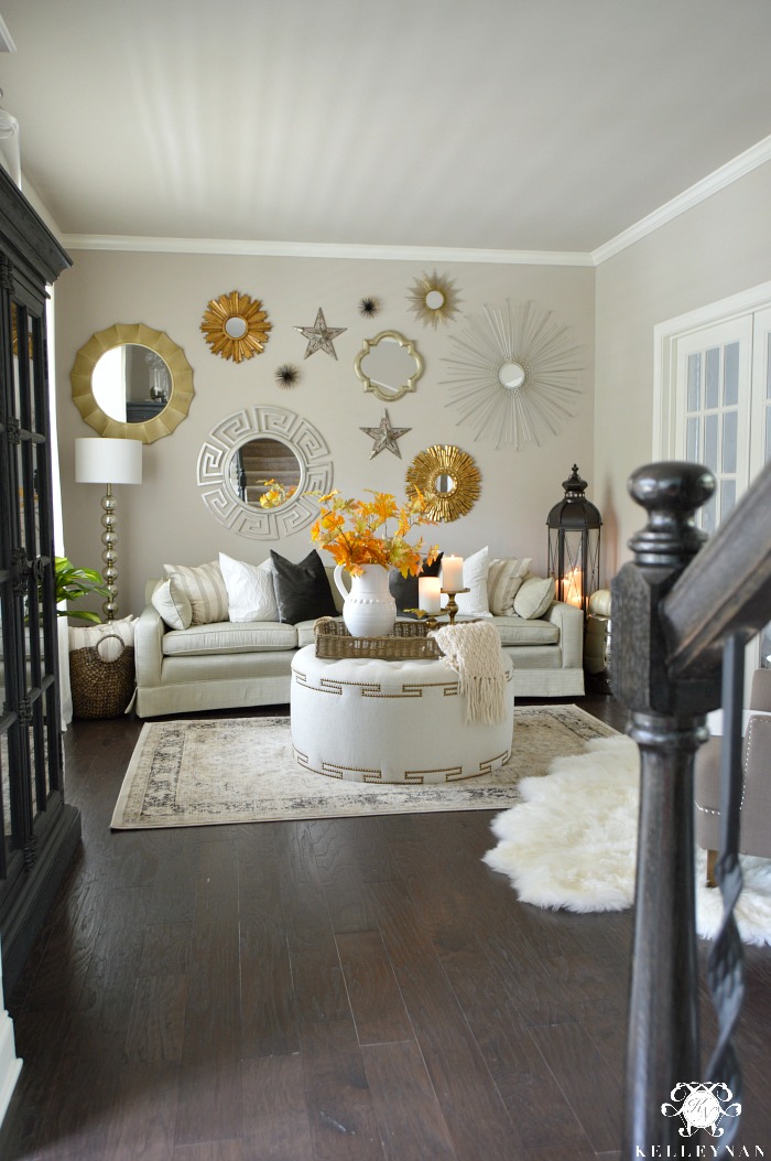
Sherwin Williams Versatile Gray
(Where is it? Great Room; Foyer; Bathrooms; Laundry Room; Upstairs and Hallways – any room/space that isn’t featured)
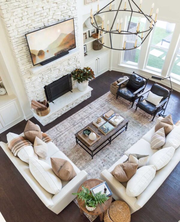
Sherwin Williams Versatile Gray (SW 6072) is the color I chose for the bulk of our home before we moved in. Any rooms/hallways you don’t see on this list will be this color. It is a greige (as indicated in the name) – part gray, part beige. While I’ve been happy (ish) with this color, at different times of the day, it does have a tendency to lean slightly violet. Inm our great room, the wall of windows brighten it up and it doesn’t feel dar until evening. (PS- see how many different shades and tones you see in this photo? This is all the same paint color- even upstairs on the catwalk.)
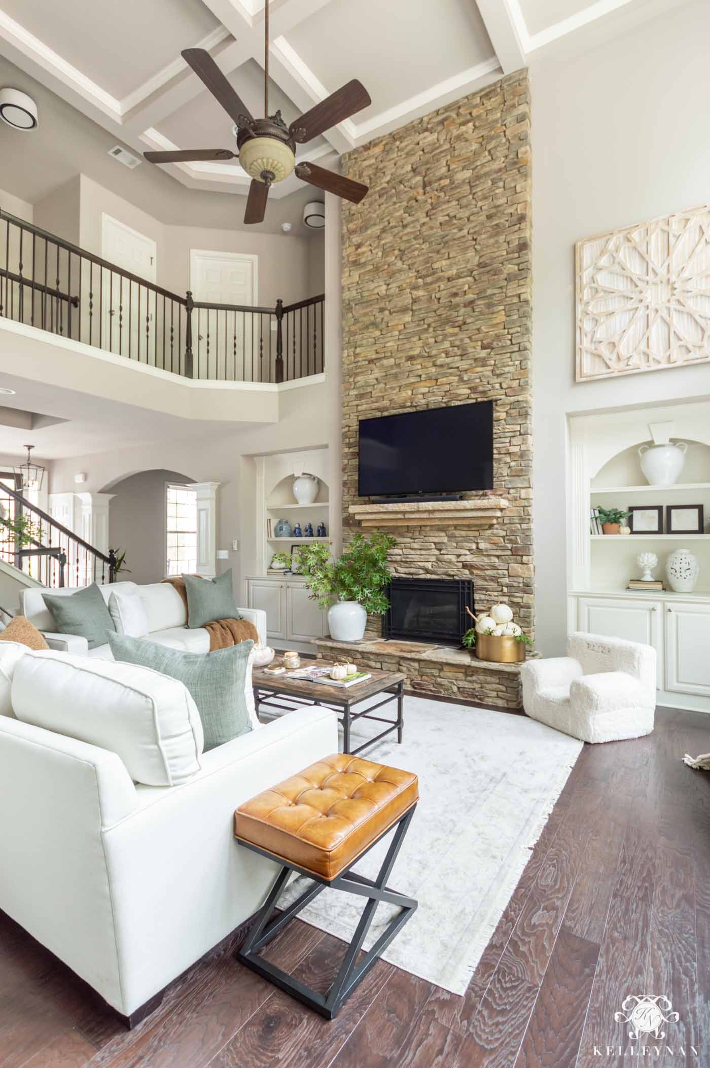
Sources: Sofa & Loveseat (Everyday Performance Linen Fabric in Ivory; square arm; upholstered) | Coffee Table | Rug | Sage Green Linen Pillows (24″) | Teddy Bear Throw Pillows (20″) | Teddy Bear Throw Blanket (largest size) | Leather Ottoman Stool | White Oversized Fireplace Vase | Brass Beverage Tub (holding pumpkins on hearth) | Child Sherpa Anywhere Chair | Fireplace Screen | White Ceramic Urn Vases on Bookshelves | Lidded Blue & White Ginger Jar | Large Wood Art
The thing about the Sherwin Williams Versatile Gray paint is that the walls in our great room are connected to most of the open areas of the house — including the stairway, upstairs catwalk, and foyer (pictured below). White I am getting closer to changing up this paint color we’ve had for six years, when we commit, all of those spaces will have to be painted all at once. The great room will involve multiple painters, scaffolding… it’s going to be a whole “thing” haha… so, I’ve drug my feet a little.
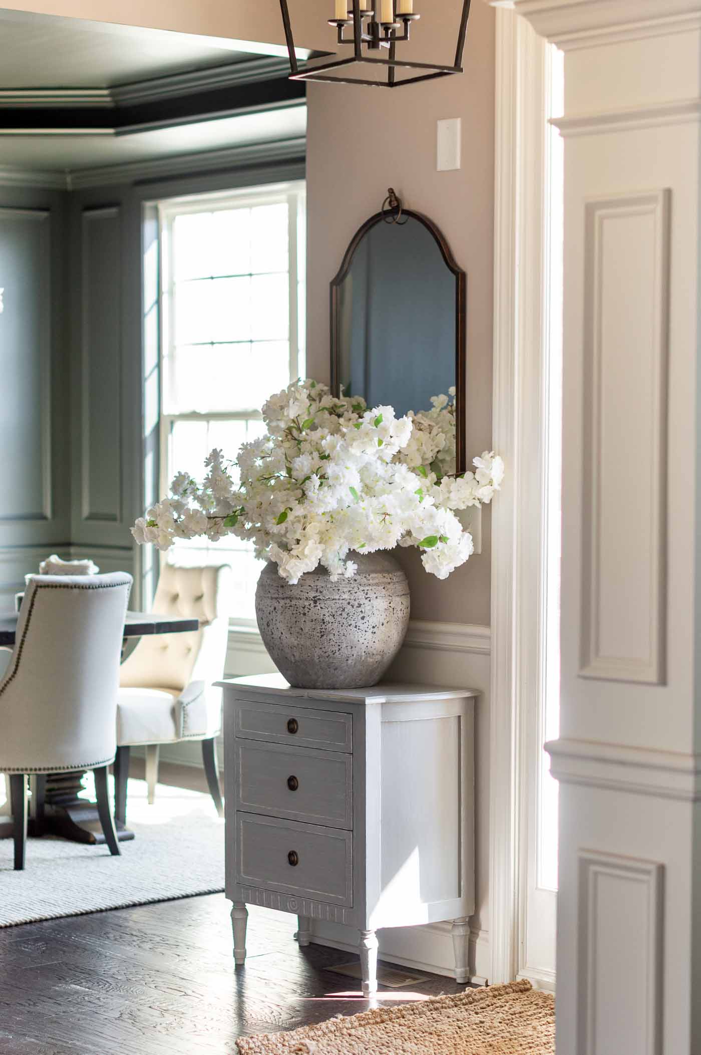
Sources: Entryway Lantern Light | Three-Drawer Chest | Mirror | Large Stoneware Vase | Faux Cherry Blossom Stems | Entryway Rug | Dining Room Chairs | Dining Room Rug
Versatile Gray looks darkest in the laundry room because there’s no natural light.
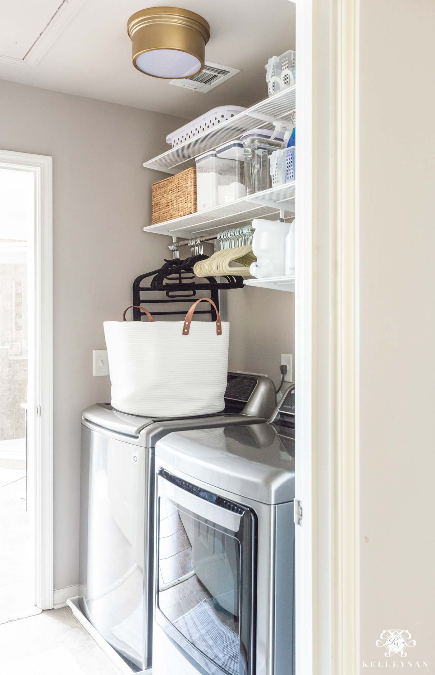
Sources: Washer | Dryer | Rope Hamper | Light Fixture | Rug | Lidded Basket | Slim Velvet Hangers (adult) | Slim Velvet Hangers (child) | Collapsible Laundry Basket | Tall OXO Large 4.5 Qt. Dispenser (for vinegar) | OXO 4.4 Qt. Dispenser (for OxiClean & baking soda) | Scoop | Clear Handled Storage Basket | Spray Bottle | Wipe Dispenser (for dryer sheets)
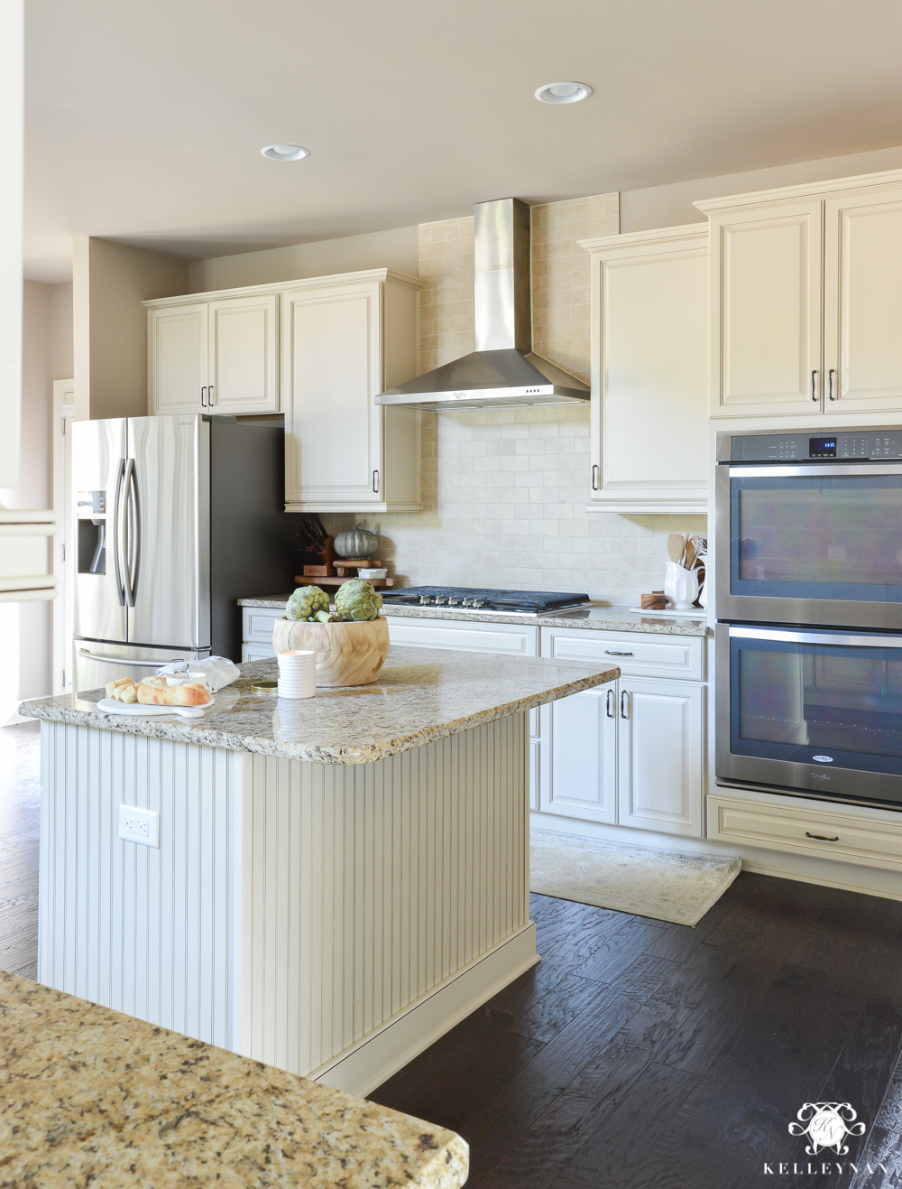
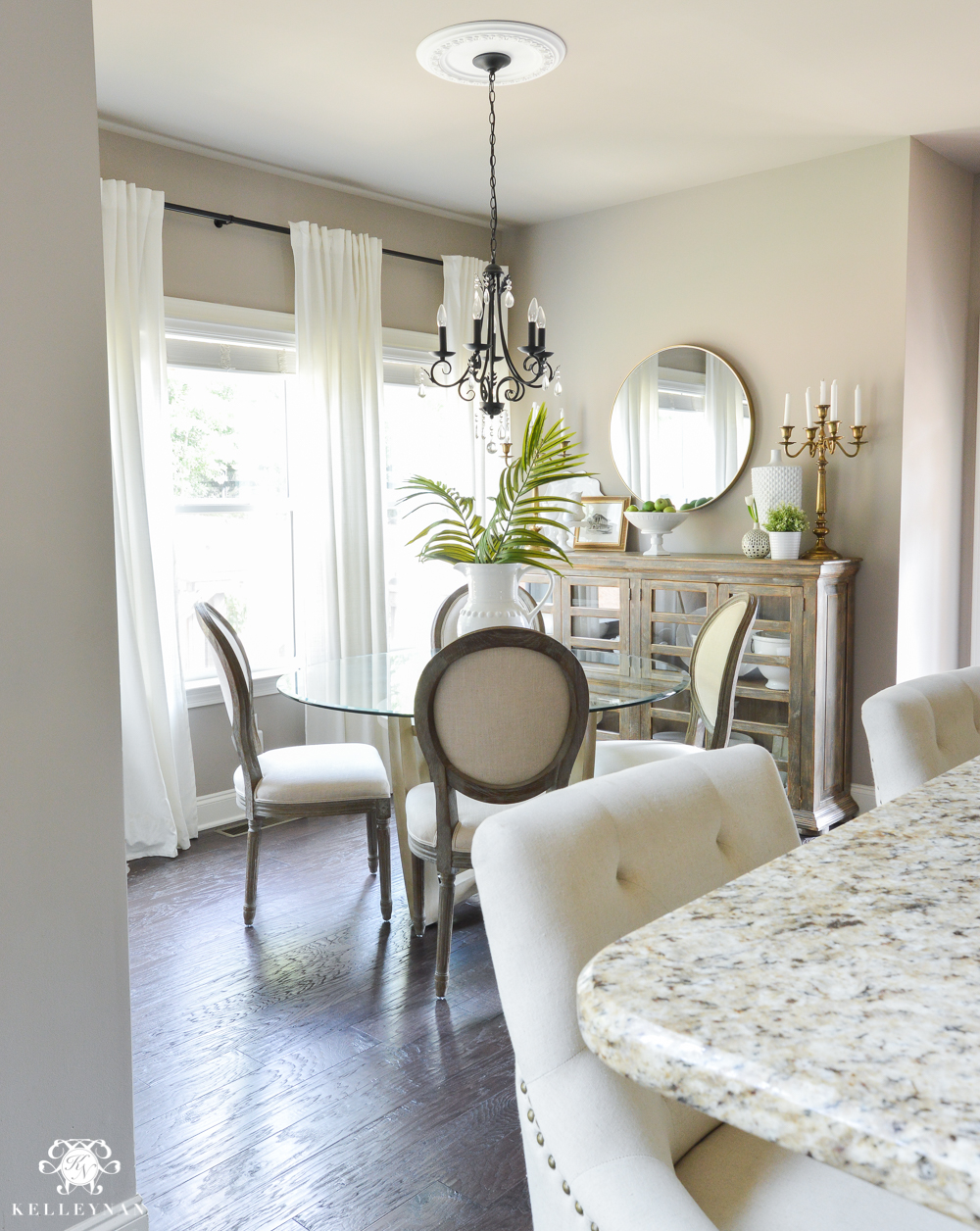
Benjamin Moore Edgecomb Gray
(Where is it? Kitchen, Breakfast Nook, Conversation Room)
When we took on our kitchen update (see the full reveal HERE), I really struggled with paint selection. Because we were only changing certain elements, we had to be intentional about making selections that would compliment our existing and remaining features — like the cabinets. Our cabinets are a cream color (exact color unknown) and while I wanted to lighten and brighten the space, I feared they would look yellow paired next to a stark white or a color that wasn’t totally fitting. After more paint swatches and color trials swathed across every inch of the kitchen and breakfast nook, I finally decided to go with Benjamin Moore Edgecomb Gray (HC-173) — a warm, lighter greige than Sherwin Williams Perfect Greige that previously covered the walls and Sherwin Williams Versatile Gray that is still present in the main part of our home. It quickly became one of my favorite neutral paint colors and while I still recommend testing in the actual space you’re considering, if you are looking for a warm light neutral but prefer something that isn’t actually white, this is an awesome choice. Here’s how Edgecomb Gray, in a matte finish, turned out in our kitchen…
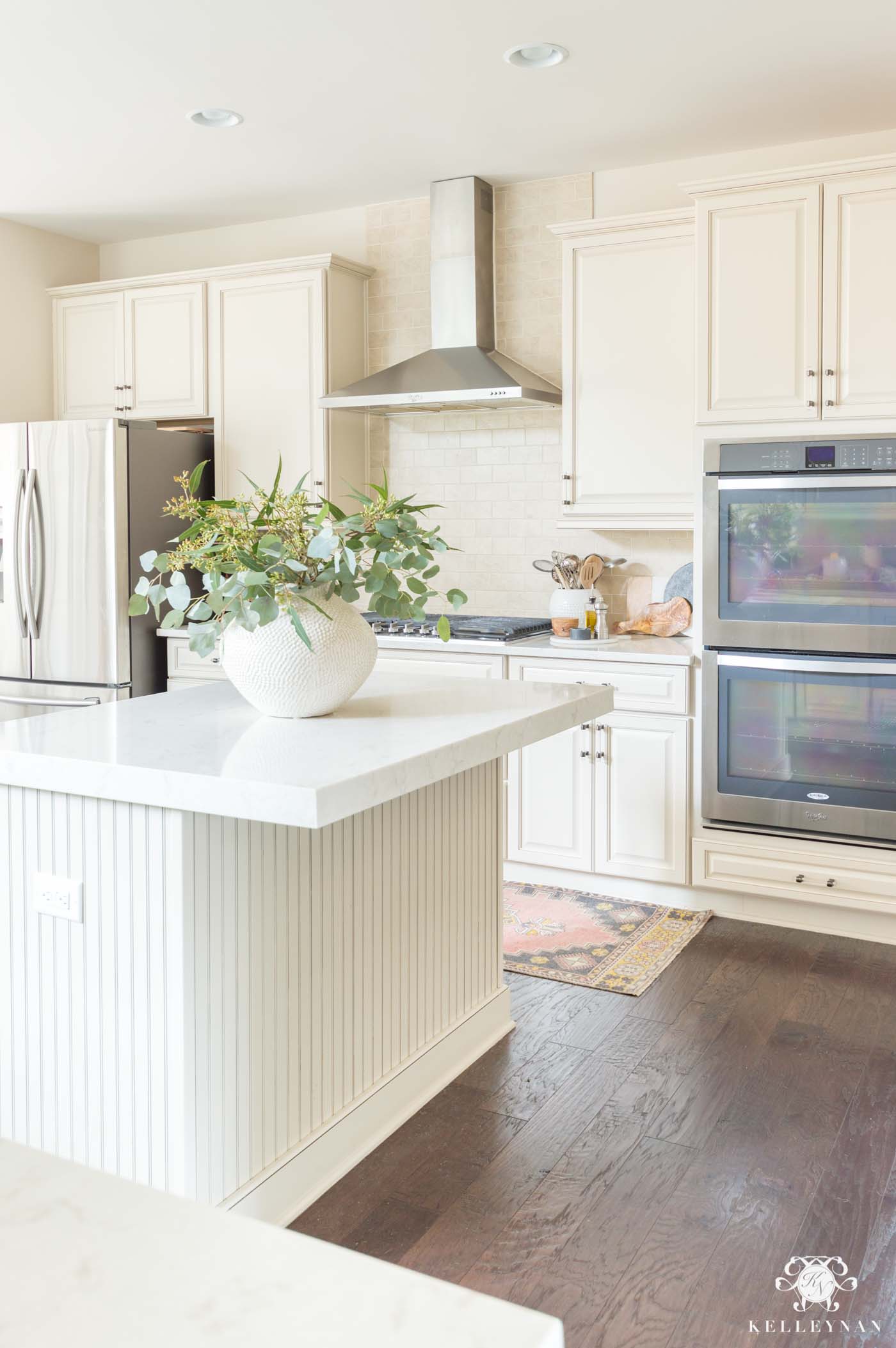
Sources: Large White Vase | Eucalyptus Stems (faux version) | Turkish Runner | Olive Oil Bottle | Olive Wood Salt Keeper |Olive Wood Cheese Board | Wooden Spoon | Cabinet and Drawer Pulls
and while we don’t have any natural light or windows within the kitchen, we do get natural light in our breakfast nook — here’s how it looks there. Also to note — and this is the only room we’ve done this in — but the ceiling paint is actually still Benjamin Moore Edgecomb Gray, but cut to 50%. I would have been fine leaving it at full strength, too.
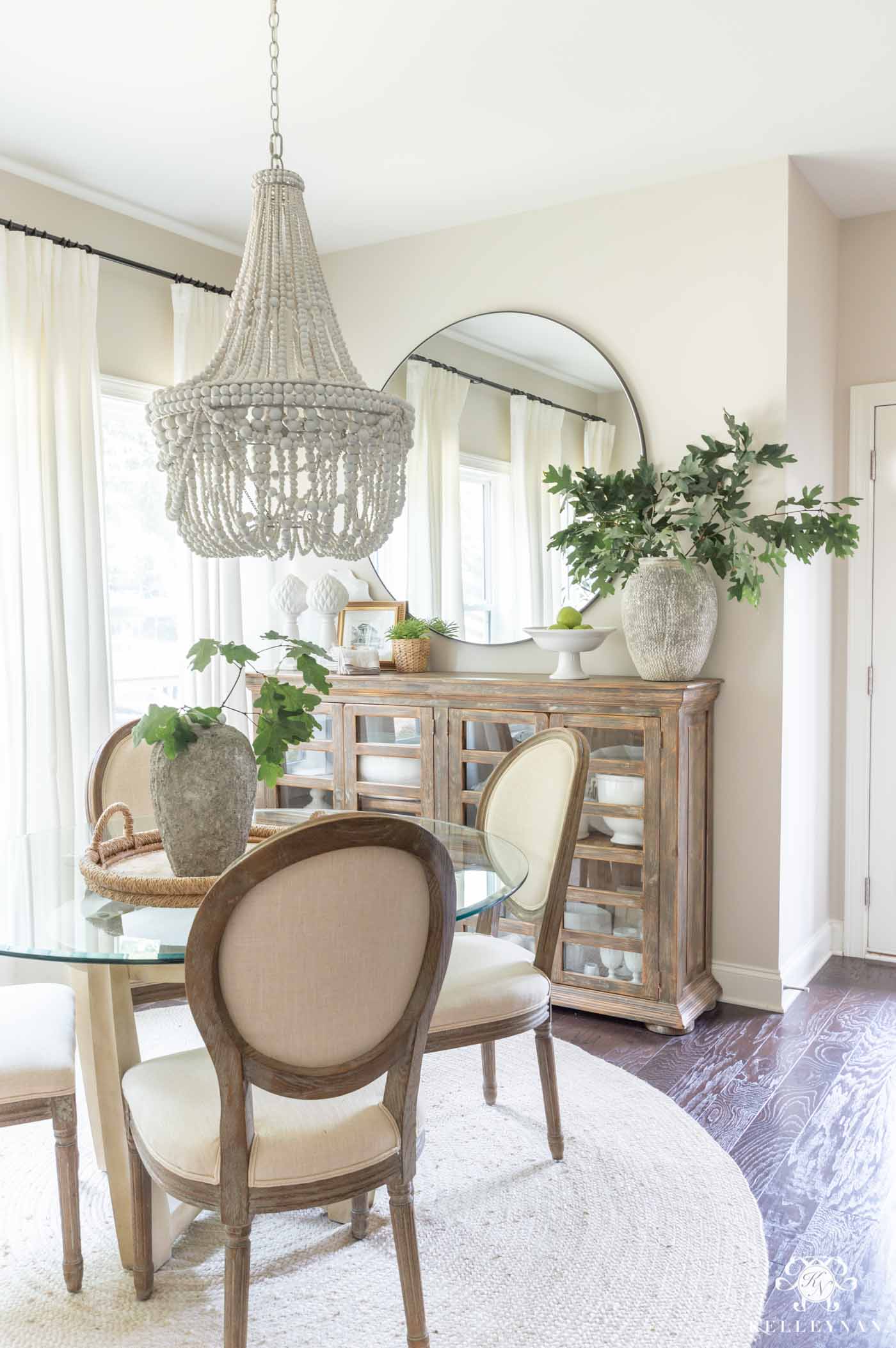
Sources: Dining Table (similar) | Dining Chairs | Rug | Beaded Chandelier | Round Mirror | Cement Vase on Sideboard | Cement Vase on Table | Curtains
We painted our kitchen and breakfast nook a couple years ago and still love it so when we started our conversation room makeover, it was one of my first picks. That room is still waiting on a few final touches before being revealed in its entirety (you can see the latest update HERE), but if you missed the progress post where I talked about paint colors, I wanted something light that would still work well with the Sherwin Williams Creamy painted columns, baseboards, and windows. Changing that warm white isn’t possible without changing the color throughout most of the house since the room isn’t closed off, so instead of going white, I decided on a warm, light greige. I tested a few other colors next to Benjamin Moore Edgecomb Gray but none were right — Edgecomb Gray was the winner again. Here’s how it looks in the in-progress conversation room, with dark ceilings.
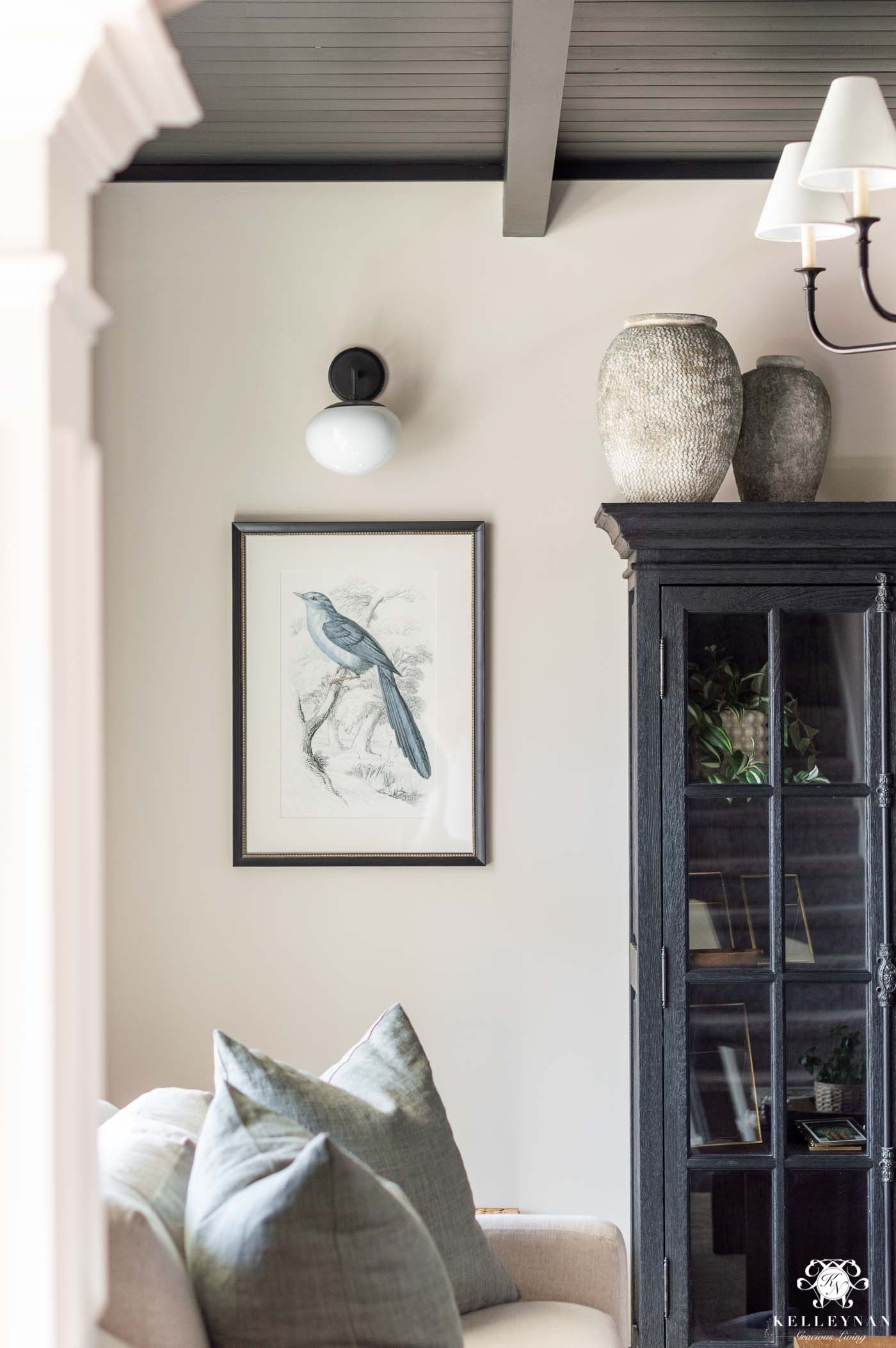
Sources: Bird Art (set) | Sconces (similar) | Belgian Flax Linen Pillow Covers (Sage Grass; 24″) | Large Cement Vase | Smaller Stone-like Vase
Sherwin Williams Tricorn Black
(Where is it? Conversation Room Ceiling)
Speaking of the conversation room, I was dying to do something different than what I’ve done in the past as far as interesting room features. I’ve had plenty of feature walls installed but I’ve never done anything cool with a ceiling. I came up with the idea for a planked black ceiling with beams and was nervous about the result — would it feel like the ceiling was too low? Would it look ok with greige paint instead of white? I painted a few small samples on the ceiling for comparison and quickly chose Sherwin Williams Tricorn Black (SW 6258) for its dark, pure black but warm appearance. (I also tested Sherwin Williams Black Magic and Sherwin Williams Iron Ore — stay tuned for more on that color later in the post!) Well, I’m certified head over heels for how it turned out. Here’s a look before some of our furnishings arrived, but you can get a nice big look at the ceiling detail.
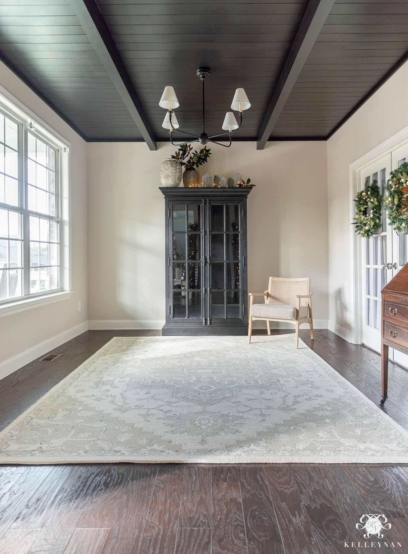
Sources: Rug | Chandelier | Cane Chair | Large Vase | Small Vase
While I haven’t tested this, an Instagram follower said they used Sherwin Williams Tricorn Black and a standard black Sharpie marker is the perfect touch up. I have a table that had scratches that I’ve used Sharpie marker on and it worked like a charm — I love that!
Sherwin Williams On the Rocks
(Where is it? Office)
While most of my paint colors are on the warmer side, I went in a different direction in my office. Sherwin Williams On the Rocks (SW 7671) is a true but cooler gray with no blue/green/purple undertones. I painted our office in this color during a room makeover (HERE) and love the color. The one thing I will say is that I actually left the trim color the same as the rest of the house and I sometimes wish I had gone lighter/less creamy.
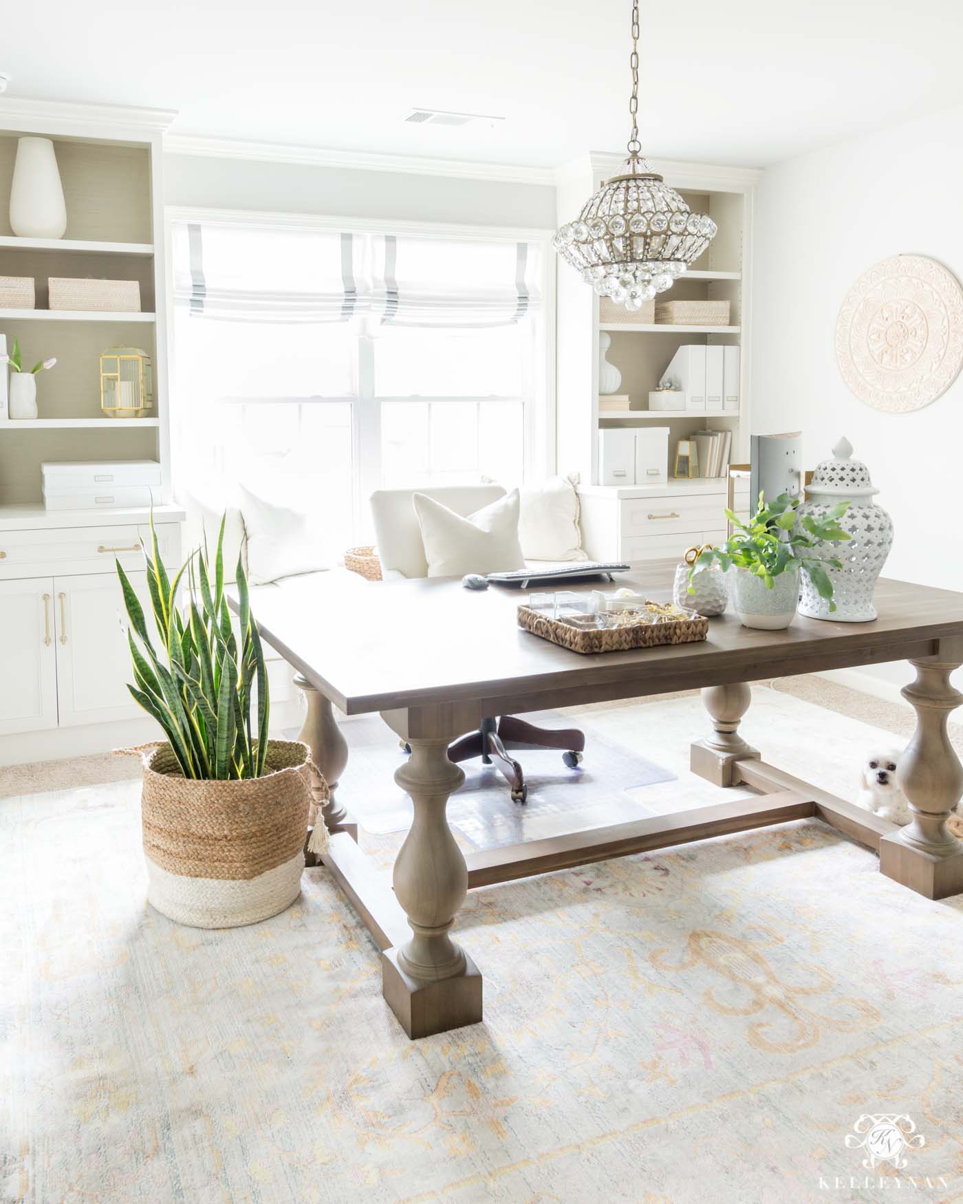
Sources: Table Desk – Restoration Hardware | Chair – Ballard Designs | Chandelier | Rug| Roman Shade | Wall Medallion | Cabinet and Drawer Hardware | Document Boxes | Magazine Holders | Rattan Storage Bins | Plant Basket | White Ginger Jar
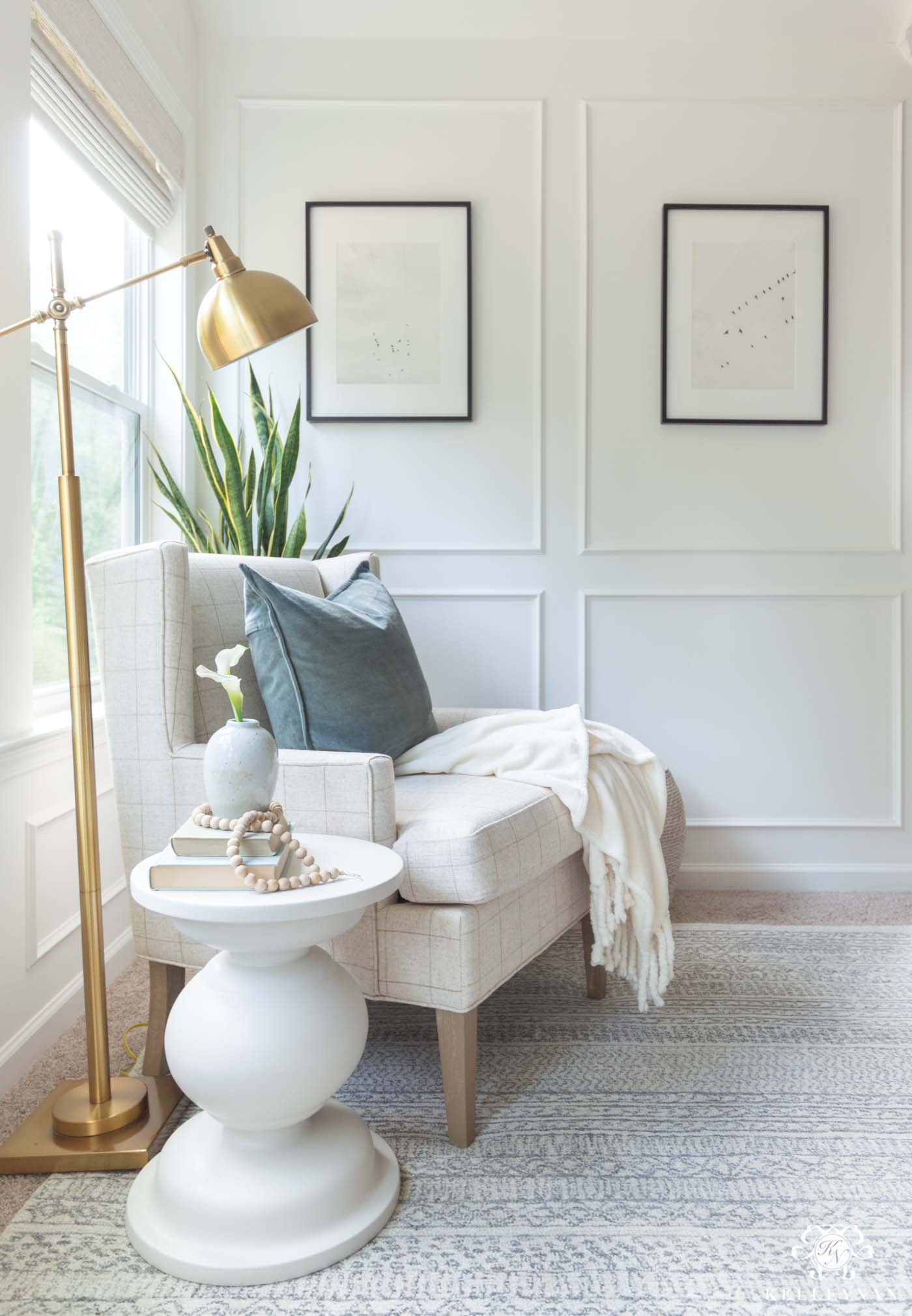
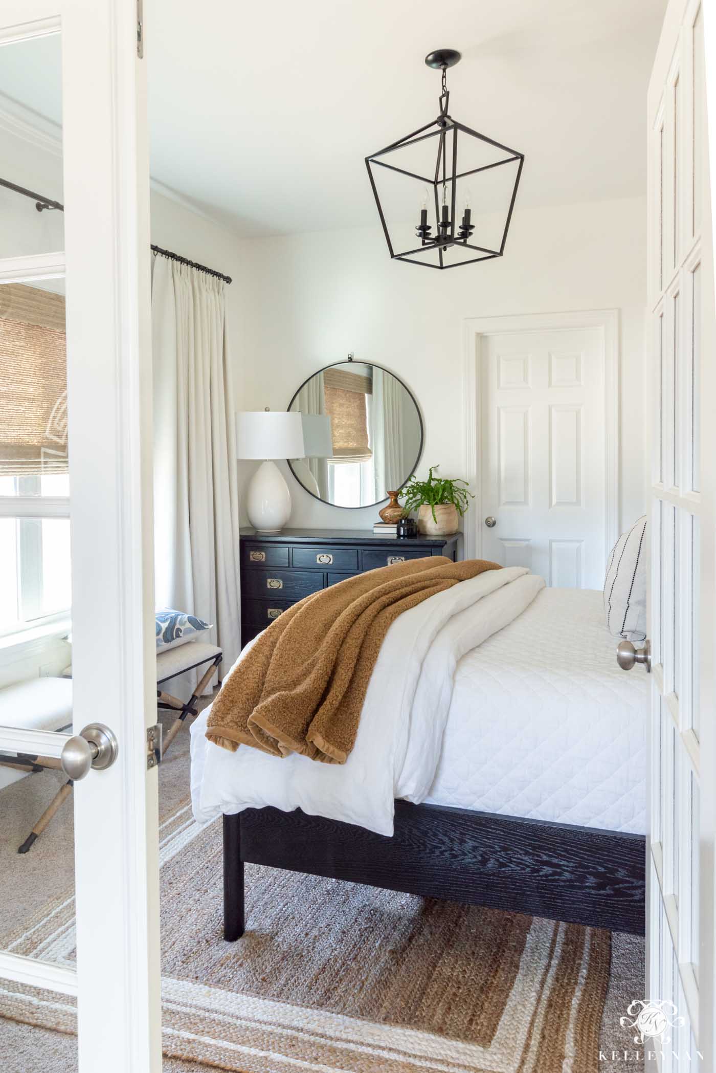
Sherwin Williams Alabaster
(Where is it? Upstairs Guest Bedroom; Former Guest Bedroom)
When I made over our upstairs guest bedroom (HERE), I went for Sherwin Williams Alabaster (SW 7008)— a warm white — since I had previous used it and loved it in a different bedroom. This room is positioned on the back corner of the house and unlike the first bedroom I painted in Alabaster, it gets little light throughout the day. While I still like it, it tends to have a little more translucent/yellowish cast in here; I have a matte finish and it may have been a little better in eggshell.
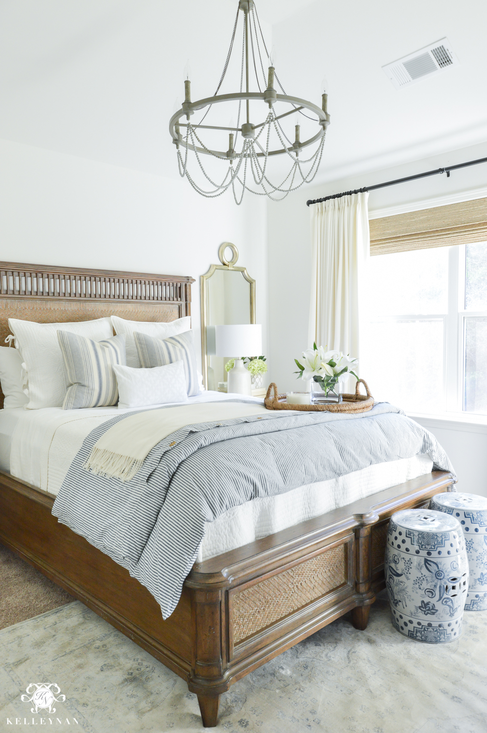
Sources: Bed – No Longer Available | Mirrors | Lamps | Rug | Quilt and Euro Shams | Duvet Cover | Chandelier
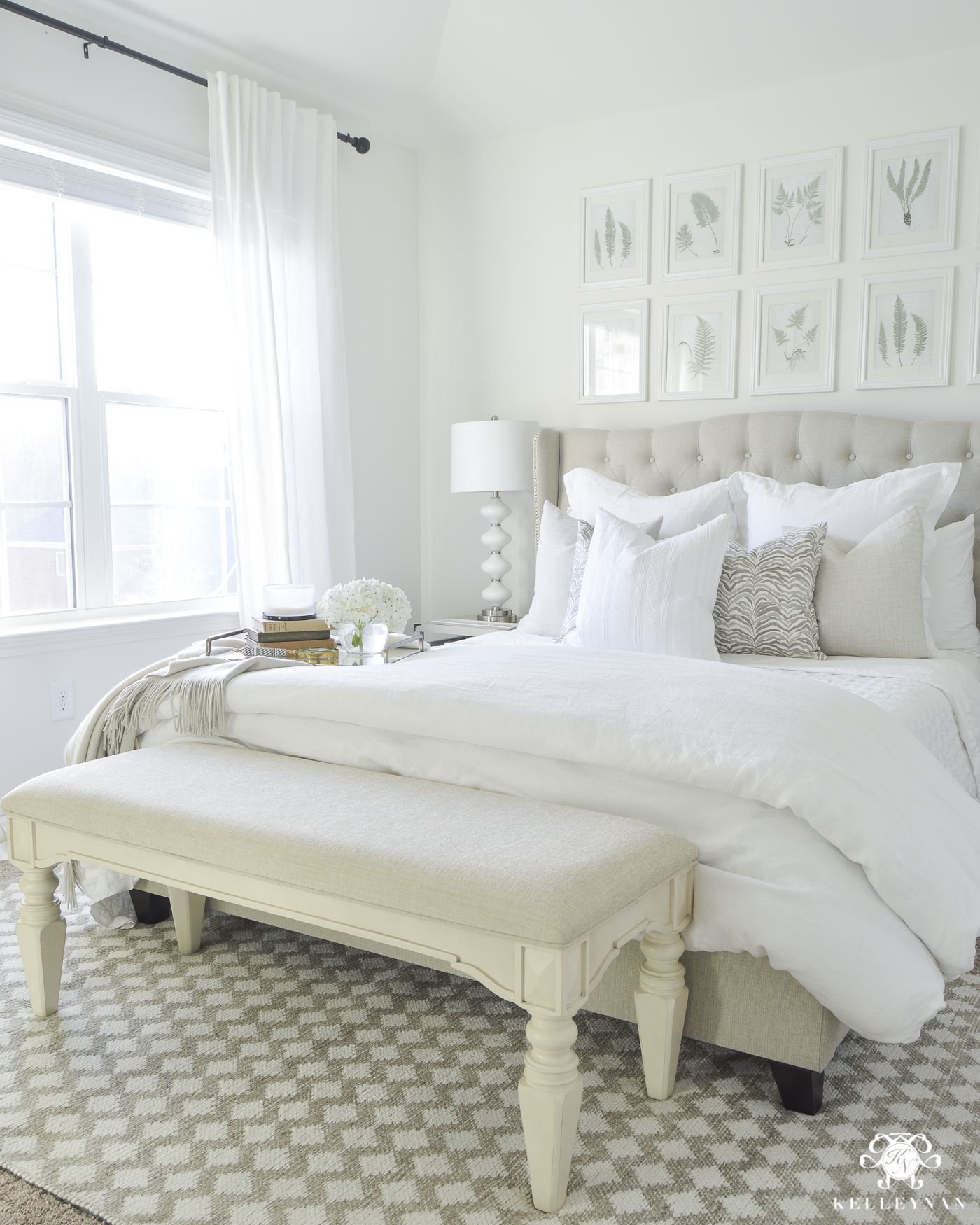
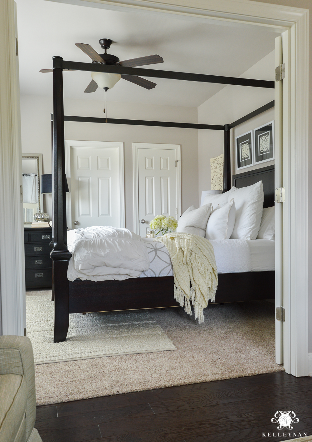
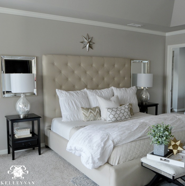
Benjamin Moore Simply White
(Where is it? Master Bedroom; Nursery; Powder Room; Downstairs Guest Bedroom; Toilet Room)
Discovering Benjamin Moore Simply White (OC-117) when we painted and made over our master bedroom a few years ago was the gift that kept giving. It’s a true but slightly warm white — crisp but not cold — and I love it. Before we painted it in Simply White, we had it painted in Sherwin Williams Versatile Gray — like most of our house was painted at some point — and with limited natural light, changing to a white paint color made a huge difference. Our master bedroom sits above the kitchen and also stays dark; again, aside from a deck door, our only windows mimic those in the breakfast nook. The walls and moulding are painted in an eggshell finish while the ceiling is flat. Because this room is closed off, we did paint the trim, baseboards, doors, and window casings that were formerly Sherwin Williams Creamy (which surely would have looked dark and yellow next to the crisp white of Benjamin Moore Simply White).
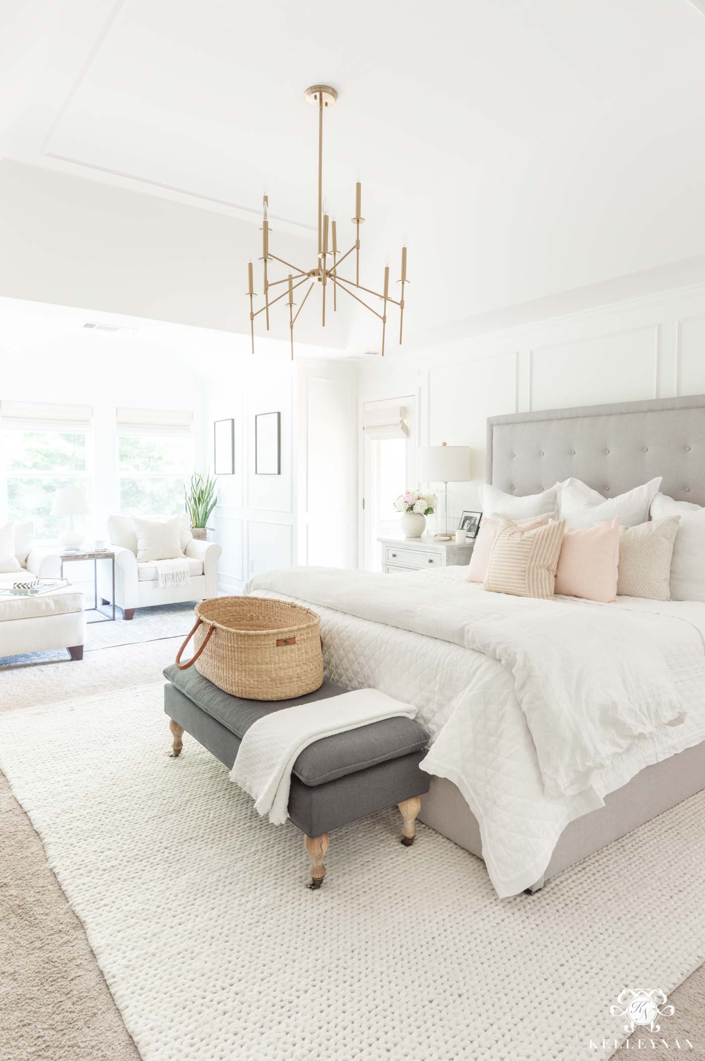
Sources: Chandelier | Rug | Bed | Bench | Nightstand | Lamp | Quilt | Duvet Cover | Pink Pillows (middle) | Moses Basket (similar)
You can see the full reveal HERE and the makeover week where I chose paint HERE.
Sources: Rug | Chair | Side Table (similar) | Floor Lamp | Art 1 | Art 2 | Pillow | Throw
When I took on the small toilet room inside my bathroom (dark with zero light), I had just enough Benjamin Moore Simply White left over from the bedroom makeover to use it for this project, too. Here it is with zero windows or natural light.
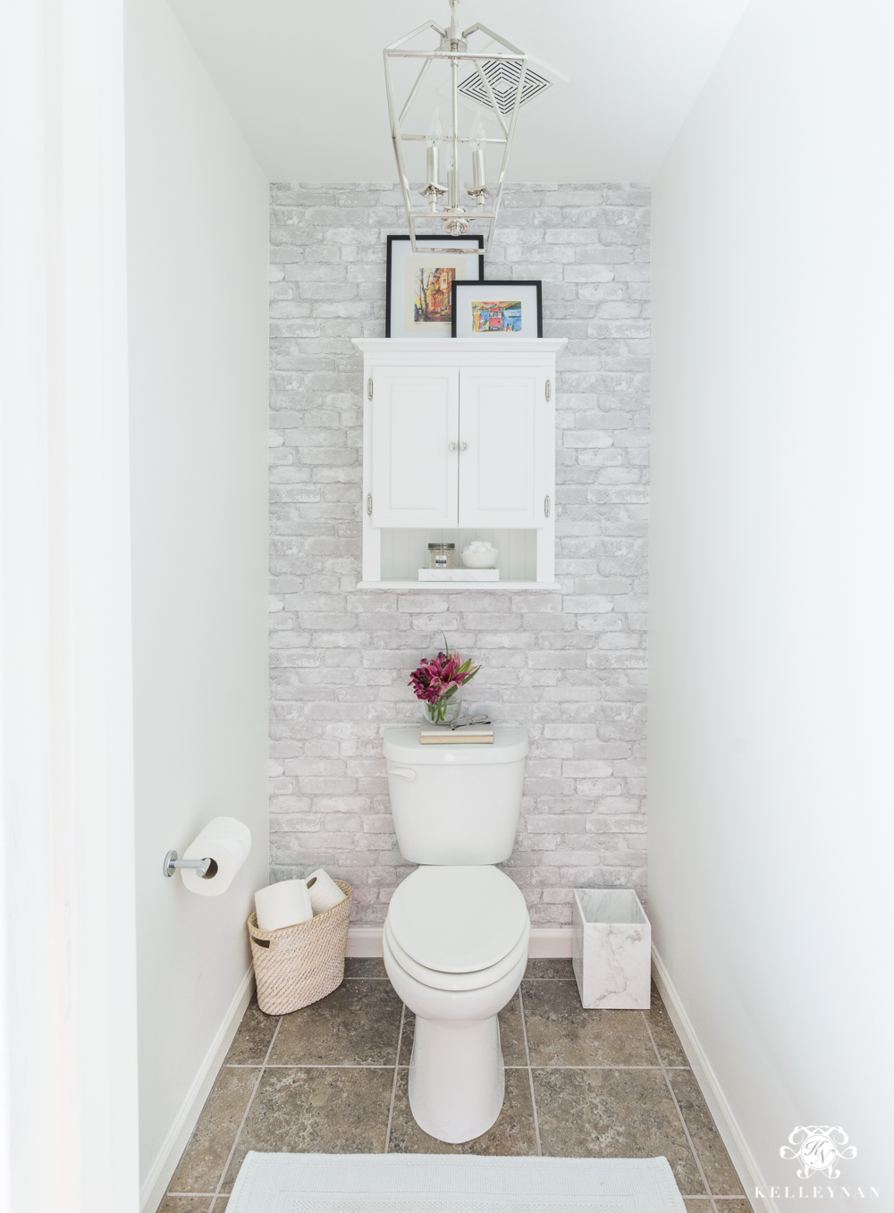
Sources: Chandelier | Wallpaper | Cabinet | Marble Trashcan | Storage Basket | Rug
After I’d lived with it a while and we were due to start the exciting task of creating a nursery, I didn’t even question which color I wanted to use. Benjamin Moore Simply White was my easy go-to. Like our bedroom, all the trim, window casings and doors were painted the same color. As a fun fact, Eliza’s Pottery Barn Kid’s bookshelf comes painted in Simply White, from the manufacturer. I later found out that most of their white furniture is BM Simply White, which makes coordinating and matching even easier!
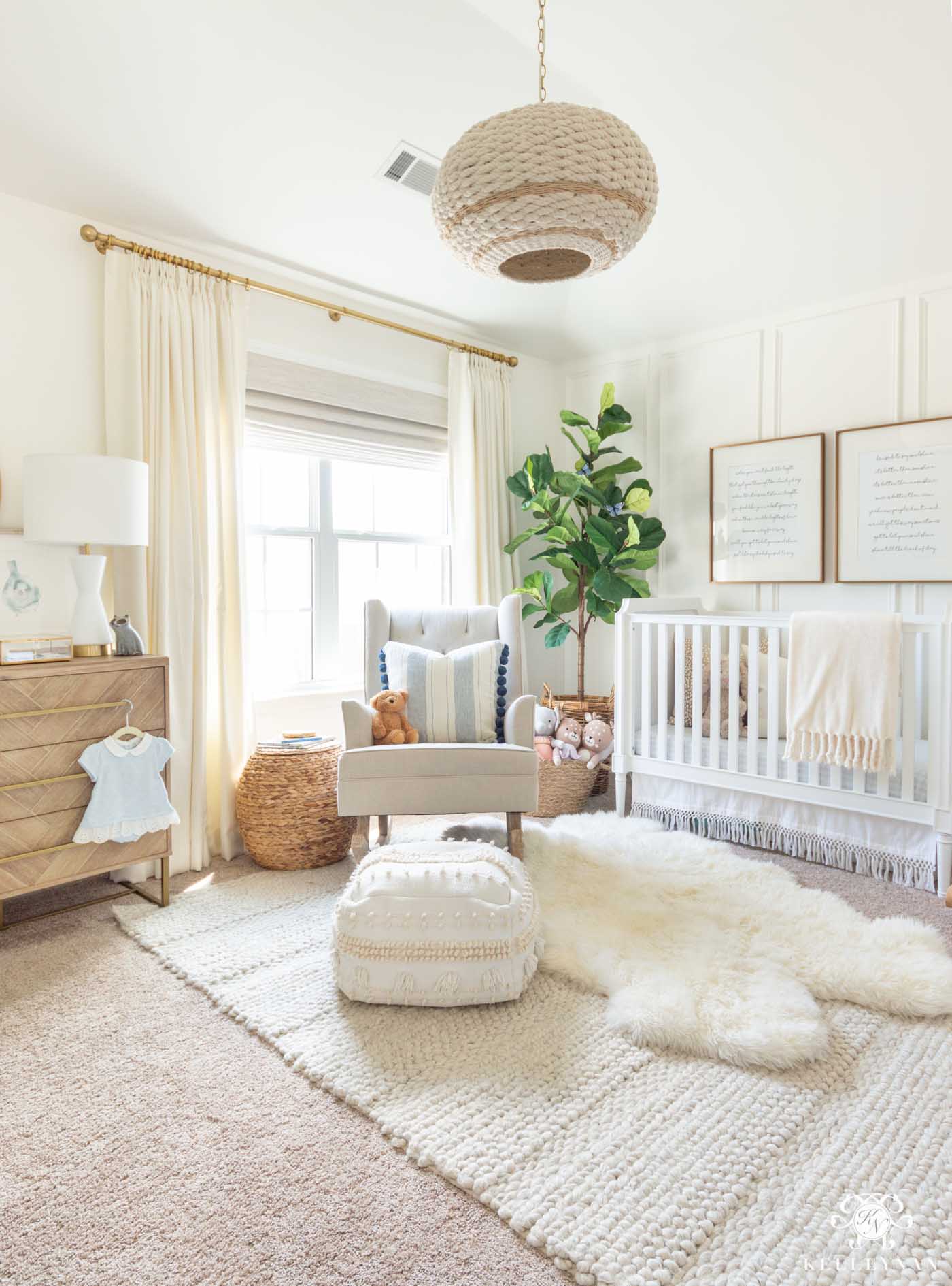
Sources: Rope Pendant Light | Crib | Crib Skirt | Woven Rug | Sheepskin Rug | Rocker | Pouf | Dresser | Fiddle Leaf Fig | Woven Storage Ottoman | Lamp | Bluebird Art | Song Lyric Art (over crib) | Throw | Blue and White Pillow Cover
And then we took on the powder room. I decided to go for a fun bold wallpaper but installed chair railing and picture frame moulding about 2/3 of the way up — and painted it all in Benjamin Moore Simply White. It goes perfectly with the white background of the blue palm frond wallpaper.
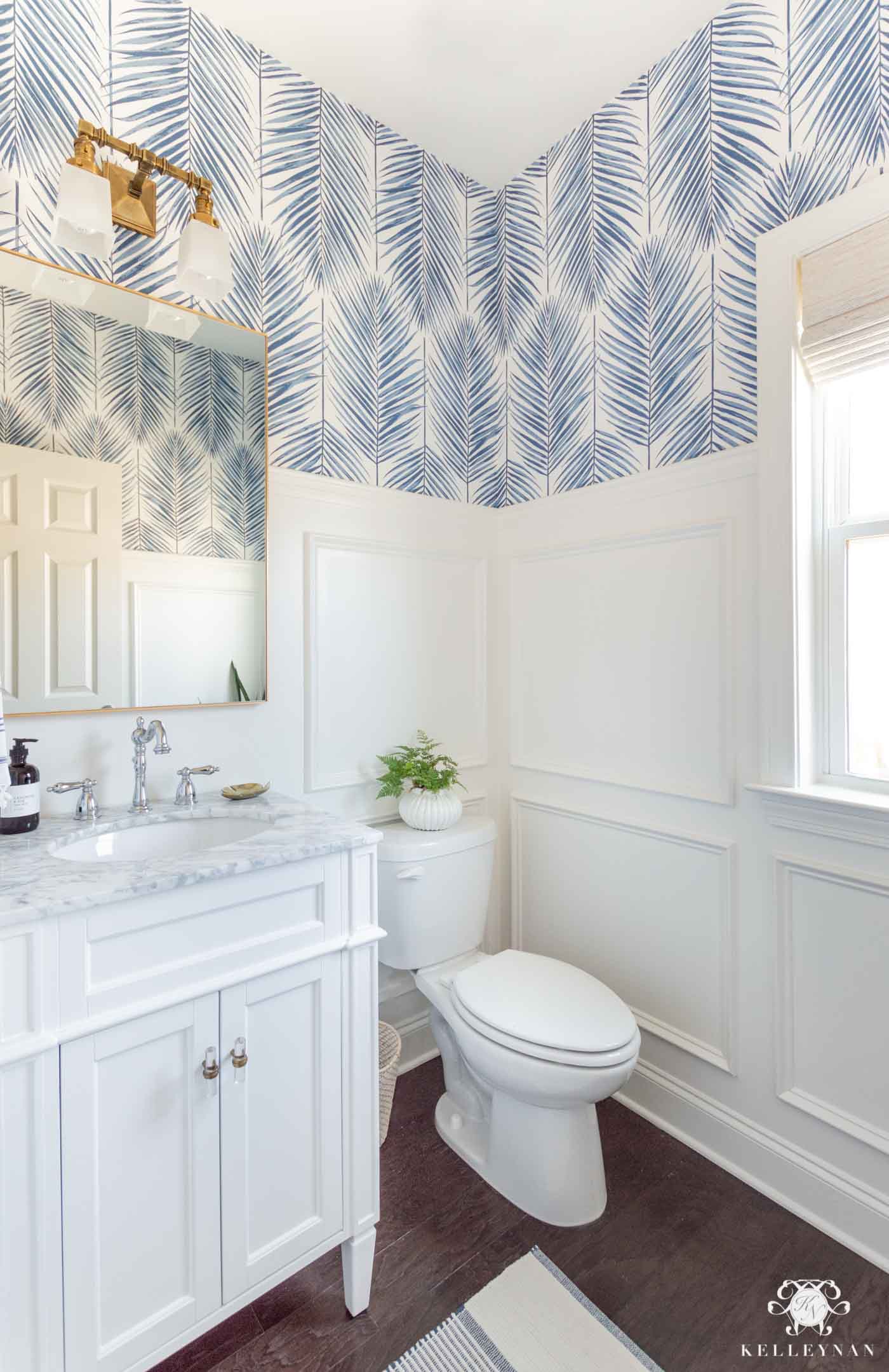
Sources: Marble Top Vanity | Faucet | Cabinet Hardware | Wallpaper | Rug | Rattan Waste Basket (similar) | Mirror | Sconce
But we still weren’t done. So, when it came time to revamp the downstairs guest bedroom, Benjamin Moore Simply White came to the rescue… again! These drapes are more creamy/ivory — the same as the nursery drapes — which proves that it looks pretty, even with other warm neutral shades.
Sources: Lantern Pendant | Rug | Lamp | Mirror | X Benches | Quilt | Duvet Cover | Teddy Bear Throw
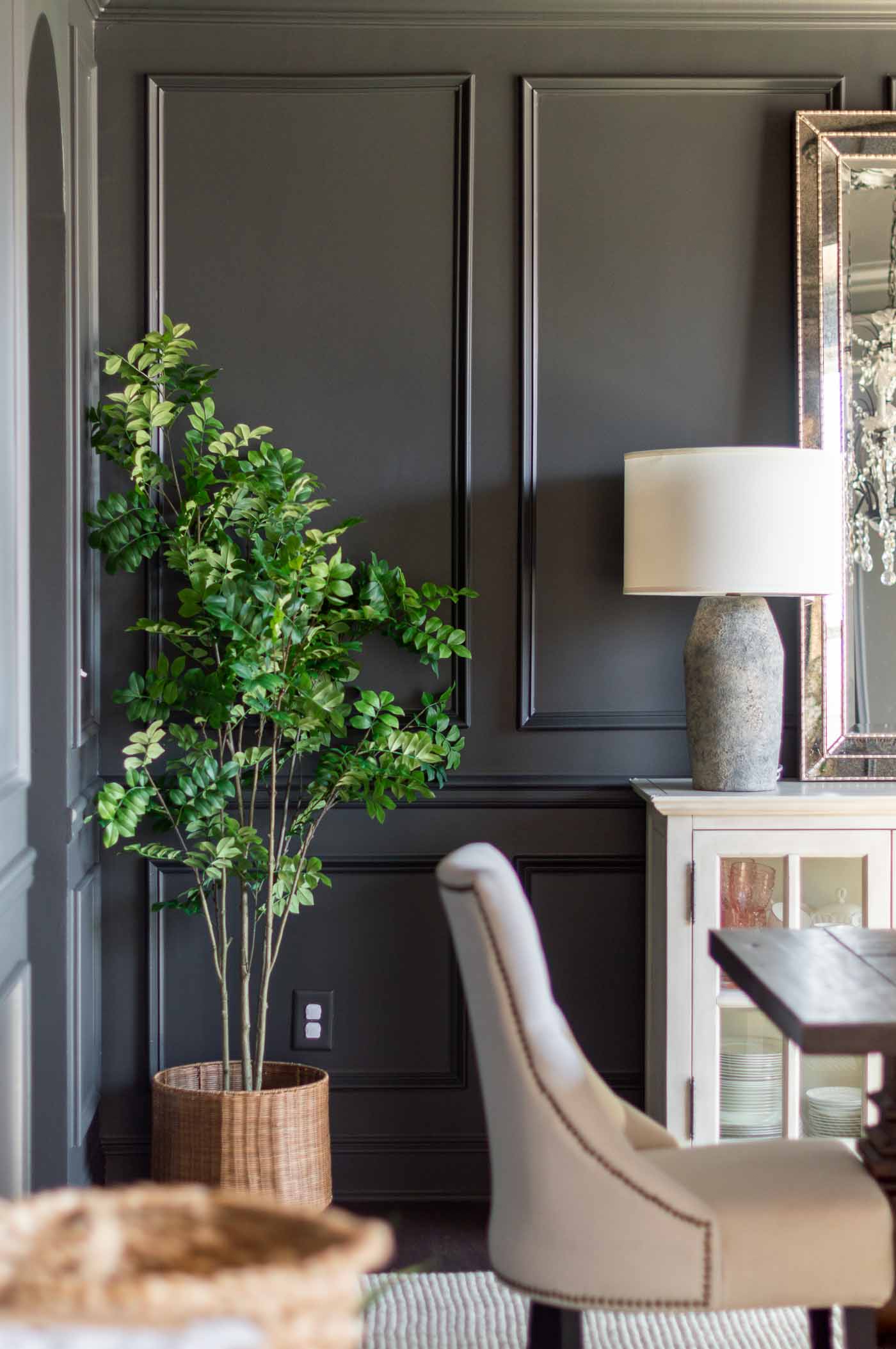
Sherwin Williams Iron Ore
(Where is it? Dining Room)
Another space that hasn’t been revealed in its entirety just yet — still under construction and in progress but you can see the latest update HERE — our dining room recently saw a total vibe change when it went from a pale, bright blue to painted dark and paneled. Sherwin Williams Iron Ore (SW 7069) was one of the paint colors I considered and tested for the planked ceiling in the conversation room (before ultimately choosing Sherwin Williams Tricorn Black) — I still had my samples on hand so I went easy on myself and tested a few swatches on different walls. My goal was something warm and black(ish) but not too black — more charcoal (but a deep charcoal; not just gray). That’s exactly what Sherwin Williams Iron Ore is and even without changing the furnishings of the room, the difference is astonishing. It’s moody but elegant, clean and looks great in light or at night especially with our chandelier on a dimmer). There’s no blue tones in SW Iron Ore and I’ll definitely be using this gorgeous shade again!
Sources: Chandelier | Rug | Dining Chair | Lamp | Faux Tree | Tree Basket
Former Paint Colors
The paint colors in the first half of the post represent our house today, as it currently stands. But, photos live on and I still get questions regarding old paint colors from former rooms. So, I thought I’d dig through the archives to get those detailed, too. Some paint colors we still have in other rooms, others we’ve eliminated, but hopefully, it’s helpful in determining what you may or may not be going for! All of these rooms are “befores” to space makeovers that I’ve taken on over the past few years so you can also scroll back up to see how different each space looks from then to now.
Sherwin Williams Lauren’s Surprise
(Where was it? Dining Room)
Before Sherwin Williams Iron Ore, our dining room was painted in a pale, vibrant blue — Lauren’s Surprise (SW 6791) . It was probably my biggest love/hate paint relationship within the walls of our house. I had envisioned a pale blue dining room for far too long and was stoked to make it a reality when we were building our home. When I was choosing paint colors, my first selection was a barely-there toned blue (I have no idea the name). Our consultant looked at me (well, kind of like I was an idiot) and said “you can barely even tell it’s blue”. That was kind of the point. But, having more embarrassment than backbone, I conceded and went a little darker which seemed to appease her attitude of “it’s not a color unless it’s in your face”. This was one of those “holy cow” moments – walking into an empty-and-under-construction home to see walls way more vibrant that I had anticipated. We actually lucked out that the dining room is the brightest room in the house so it helped wash out some of the color. But, at night or evening, the blue paint was also way more prominent. Did I love my dining room? Yes. Would I pick this color again? No. Do I love it more now? YES. Lauren’s Surprise has actually been “archived” but is still available if you ask your Sherwin Williams store to pull it up in the system.
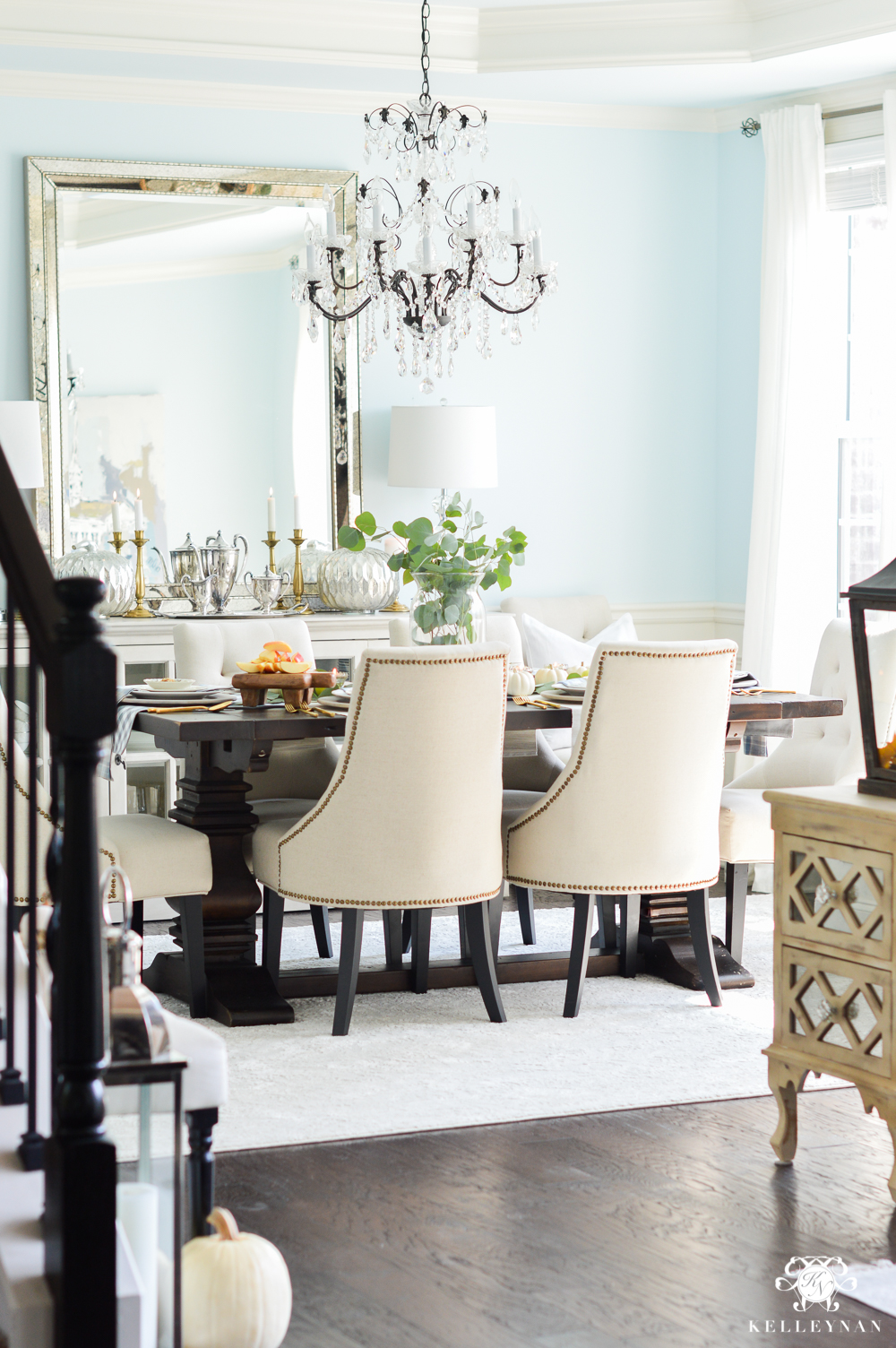
Sources: Chandelier | Dining Chair
Sherwin Williams Alabaster
(Where was it? Guest Bedroom)
My love affair with white walls started about two years ago when I made over my guest bedroom. I used Sherwin Williams Alabaster (SW 7008) — their “color of the year” that year — to paint one of our guest bedrooms (take a walk down memory lane to the guest bedroom before it was Eliza’s nursery HERE). It’s a warmer white and is actually similar in color to our trim, Creamy. I absolutely loved it in this bedroom — more-so than the above blue and white guest bedroom which is still painted Alabaster — which gets a LOT of natural light. As a warning, if you have ivory bedding/linens, it will probably make them look yellow.
Sources: Curtains | Gallery Wall Frames | Rug | Bed | Fringed Pillow | Ticking Stripe Pillow | Fringed Throw | Quilt | Duvet Cover
Sherwin Williams Versatile Gray
(Where was it? Kitchen; Breakfast Nook; Formal Living Room; Downstairs Guest Bedroom; Master Bedroom)
Our formal living room is in the midst of transitioning and is now known as the “conversation room”. But before there were black ceilings and Edgecomb Gray walls, there were slightly darker greige walls — Sherwin Williams Versatile Gray — decorated in a gallery of sunburst mirrors. is just off the great room and it too is Versatile Gray. The windows face a different direction than the living room/great room so the paint tends to look a bit darker in here. The ceilings are painted in the same shade, also.
Sources: Ottoman
The downstairs guest bedroom was also painted in Sherwin Williams Versatile Gray…
Sources: Rug | Duvet Cover
As was the master bedroom. (Holy cow to the makeover!) Light has to make its way across the entire room to reach the other side. I wanted to brighten it up desperately, which ultimately led to the Benjamin Moore Simply White walls (as seen toward the top of the post). While it appears darker, remember, this is the same color that is in my great room.
Sources: Bed | Linen Quilt | Duvet Cover & Shams
Sherwin Williams Perfect Greige
(Where was it? Kitchen; Breakfast Nook)
Sherwin Williams Perfect Greige (SW 6073) is on the same paint chip as Sherwin Williams Versatile Gray — just one shade darker. One of the reasons I wish we had waited on paying a premium to paint all the rooms in our home non-standard colors is I didn’t realize how dark our kitchen would be. Aside from the windows on the other side of the room in the breakfast nook, this space has zero natural light. It’s brightest around 9:00 a.m. but is a shadowy, central hub 95% of the time. Here’s how the kitchen looked before the countertops were changed, a few upgrades were added, and the walls were lightened…
And here’s an old throwback to our breakfast nook, also painted from head to toe in Sherwin Williams Perfect Greige. Even next to the windows, if you prefer bright and airy, it’s probably not the color for you.
Sources: Dining Chairs | Bar Stools | Curtains
So many of the rooms and walls in our home are still in need a fresh coat of paint; the house has settled, the walls are scuffed, and now that several rooms have been individually painted, the thought of tackling the main areas is a little less daunting. It’s a tricky thing — picking paint. And, it’s next to impossible to know exactly what a color will look like throughout the day in every part of the room. Searching online is a good place to start, but take your time, invest in actual samples, and paint in different parts of the room (next to windows, away from windows, next to trim, etc.) Spending “too much” on samples is way better than investing in an entire room/house color that you end up hating.


Wow girl you are helping SO MANY by posting your own experience! Paint can be tricky and just like you said lighting, furnishings, windows all change the hue! Really sweet of you to take the time to share all the details! Your home is gorgeous, I love all the rooms! ?
I look forward to your decor ideas.
Paint is the easiest and inexpensive way to change a room and feel good about it! Thanks for you sharing all the time.
It makes such a huge difference!
Tammy, that means so much! Happy Monday and THANK YOU!
Thank you for this post! Loved it ! Would you say that versatile gray is a beige with a gray undertone ? Is it warm ??
Hi, Jess! It is definitely warm but hard to say what tones it has more of (it is a greige, also). In our great room, it tends to look more gray with beige undertones but in other spaces, it can look more taupe with gray undertones.
Excelllent post. In the process of considering pint colors. This post was very helpful.
Connie, I am so glad and thank you! Best of luck!
Thx for all the great info….picking a paint color is VERY difficult! You have done a great job of explaining your paint colors. Your insight and honest critiques will help lots of people!
Michelle, you are so kind to say that; thank you!
It’s not easy to pick a paint color and this will be so help to so many people! I loved looking at all your rooms once again and love the “videos” on your site – hugs!
Joni, thank you!!! Sending you hugs today!
Great tips Kelley. We plan to repaint much of our interior this year. It can be a daunting task.
Lauren, you are so right! I am itching to freshen some up too.
I love the colors and I covet your sitting area. My kitchen, dining room, and great room are all one big room and my kitchen is the same layout as yours (in reverse). I am curious about what you plan to change in your kitchen. I have solid custom maple cabinets all over my house and hate them. They have faded from a light white glaze to a yellowish color. I would love to paint my kitchen cabinets white but then would have to paint the bookshelves across the room white…not sure I could talk my sweet husband into that ;). Any whoooo, I look forward to seeing where you go with your kitchen; I know it will be stunning as is all your decor.
Cecilia, I am in the same boat! If you do one thing, you do another, and another, etc. haha. My countertops actually cracked on one side a few weeks ago (maybe the house shifted? I have NO idea). So, I am trying to determine what we will do and how that will change everything. Definitely not in a position to re-do everything but MAY be changing countertops, cabinet hardware, and room color…
I have SUCH a hard time choosing paint colors and often regret them later! I don’t see the detail terms like you do. Wish I did! When we moved into our prebuilt house, the builder had painted all walls and ceilings in a tan color. We’ve slowly gone room by room and painted ceilings and walls. I’m always wondering if it’s better to keep the whole house one color and have completely different colors in different rooms?
Hi Libbe, I agree that paint is so hard! We had a lot of the same paint colors when we first moved into our house. Along the way, most paint colors have been changed. I love that a little paint goes a long way in making a big impact. As you can see, we have changed to a variety of paint colors, but I am always aware of the adjoining room colors when I repaint.
I’ve painted so many rooms so many times with the wrong paint. I LOVE LOVE LOVE that you posted this! I always end up with the “it’s too bright!” problem and this will help me keep that in mind when choosing paint again.
Joanne, I think most of us have! haha
I like the idea of painting the ceiling the same color of the walls. Your paint colors flow so nicely. Thanks for the ideas and honesty about your color choices .
Bennie, thank you! This house was the first time I have had that and I love the look.
Thanks for your critiques….it really helps and gives you things to think about when choosing a color. I just love reading your comments! Thanks for sharing yourself and your home. Love, love the colors in you home, especially the bedroom. Enjoy your day.
Joss, thank you! It is such a tricky thing. Have a great week!
I love your paint color choices… so beautiful and fresh.
Jenny, thank you!
Just discovered you on Pinterest and decided to visit your blog instead of getting to work like I SHOULD be doing. 😉 Anyway, girl you should see my walls right now. Just stripped off 16 year old wallpaper and have applied the spackle. The walls look like they have the chickenpox. Sigh…. Anyway I went to Home Depot with my fistful of switches from SW and BM and put up EIGHT different paint samples. Eight. Gray, greige, beige. Wow. Thank goodness. They are all so different! But I think I have found one. Now to paint! Thanks for your site. Very beautiful!
Julie, thank you for taking the time to leave me a note and oh my goodness, isn’t selection a stressful chore?! GOOD LUCK and I hope they turn out fantastic!
Hello Kelly Nan, we are in the process of buying a 1940 home for less than $45,000 – OMG the work it needs. Trying to get ideas that are budget friendly yet look complete (not cheap). While searching for panels came across your site. When I saw your gorgeous home yet you used IKEA curtains – I thought now I can afford to get ideas from her. Yay.
Jana, that is awesome! They are FANTASTIC budget panels that look like their quality far exceeds the cost- I hope you love them!!
Thank you, for the ideas…
Just moved into our new home by a lake, and i am feeling overwhelmed on how to decorate an open concept space. I’ve chosen a color for the master bedroom that i already hate. Thanks for the inspiration, your home is beautiful!
I so feel you! Take your time and do lots and lots of testing!
Hi Kelley,
I wonder what color would you choose for your dining room for the next makeover? I think Lauren surprise is a little too bright and I wanted to hear from your opinion and your future color for dining room.
Hi, Grace! That is a great question and honestly, I have no idea haha. I love light blue in a dining room (but preferably a paler shade) but if I do change it, I will probably go a different direction all together (just to mix it up). That being said, I don’t know if it would be white, wallpapered, greige, purple or black… You’re really making me want to come up with a design plan! haha
I’m considering several of these colors for my home addition we are building this winter and this was very helpful! Gorgeous home!
Hi Stacey, Thank you for stopping by. I am so glad this post was helpful to you and wish you the best with your new home addition!
Hi! Can you tell me again what the new paint on your walls in kitchen, breakfast and family/great room is again and is your trim on the cabinets abs molding still Creamy? Also the trim and finish out around your bar is painted Creamy also? Thank you!
Hi, Kari! The new kitchen/breakfast nook color is Edgecomb Gray by Benjamin Moore. The great room is still the same and the moulding/doors are still Creamy by SW. The trim under the bar is also Creamy. I don’t know what the cabinet color is (it did stay the same but I don’t know it :/)
If you were painting your entire condo in either simply white or alabaster what would you choose? There are areas with a huge amount of light from the east and then areas where there will be light from the west. I keep going between the two(alabaster and simply white ) and pure white by SW and I can’t decide. I don’t want yellow undertones and I don’t want it to look dingy in the dark. Since you have experience with both colors and your home is absolutely gorgeous I thought maybe you could help 🙂 Thank you!
Hi, Julie! In my home, my favorite of the two is Simply White 😉
Hi! I see you use Creamy for your trim, what finish is your trim? Semi-gloss? Your bedroom, I love in Simply White, is the trim a semi-gloss too?
Thank you! Lesley 🙂
Semi-gloss 😉 The bedroom though is actually all Simply White and if I remember correctly, that is actually satin.
I’m about to have most of my house and all of my main living space painted versatile grey. Can you tell me what white your trim is painted?
Creamy by Sherwin Williams
What type of paint do you use for bathroom walls? Should bedrooms, kitchens and living areas be semi-gloss, satin or egg shell? Thank you!
Hi Tracy, I typically would do egg shell in the bathroom. Unless, a room has a paneled wall, I would do egg shell or matte.
Loved your advice. I read on the internet that SW Creamy is a duplicate for the soft white paint used on Pottery Barn furniture. Would you agree? I am painting a variety of vintage mahogany stained furniture that belong to my grandmother which is going in a room with a painted PB piece. It’s going to be a lot of work so I want to choose the best paint color. Thanks in advance.
Hi Jane, Thank you so much! Choosing the right paint color is so tough. Light and the original finish are both big factors. I recommend that you start small with your chosen color before you commit to the entire project. I am sorry that I can not speak to the white paint used on Pottery Barn furniture as I don’t have any pieces with that finish. I love that you are giving new life to your grandmother’s furniture and wish you the best of luck in the process.
Thank you Kellynan for sharing your gorgeous home! Your taste is impeccable, every room warm, welcoming and beautiful. I am seeking advise regarding my home in Florida which is West and East facing. I sure wish I had found you earlier, I think I have made some errors in trying to achieve a look like your. I have had my kitchen cabinets, ceilings and trim painted Benjamin Moore Cloud White and have a off white quartz with gray and beige veining in the kitchen and small bathroom. The problem is my wall color, I had it in my mind to paint the walls cloud white too but the painter convinced me that there would not be enough contrast. Every gray, Greige color I put on my walls had either pink or green undertones and appeared to dark, so we went with Sherwin Williams Creamy., which by samples put on my walls did not appear to yellow but a warm white with little contrast to cloud white. The wall painting process started yesterday with the front of house and sunroom and definitely has a yellow cast to it. Before going any further can you give me any suggestions, should I have the painter tweak the color lighter, or change to the cloud white in the other rooms which are on the back east side of the house? At this time my flooring is Brazelian cherry hardwoods( left in home fro previous owners and hoping to change eventually) The sunroom and kitchen are beige, brown, gray Travertine. I have quite a lot of dark antique furniture which I am planing on painting a oyster type color, my upholstered furniture is creams, beige with black and warm colored oriental rugs and accessories in champagne gold and gold. I am a Hospice nurse and have been working overtime for the past several years to save for this project and need to avoid any further mistakes. Thank you for reading this long email and for any help you can give. Sending you warm wishes and prayers for continued blessings in your life. Sincerely, Joy
Hi Joy, Thank you so much for taking the time to stop by! Since this post, I have repainted my kitchen and breakfast room Edgecomb Gray by Benjamin Moore. There is an updated kitchen post here: https://kelleynan.com/cream-kitchen-update-modern-transitional/
I have also repainted several rooms (master bedroom, powder room, Eliza’s room and guest room) Simply White by Benjamin Moore for a brighter look.
Prior to painting, I also try a few sample colors first and view them at different times of the day to see what the light will do.
Picking a color can be so hard! I know paint colors are very fickle. I wish you the best in your kitchen project. I really appreciate your kind words! xoxo
Kelley,
Wow! What an awesome post. Aside from loving your beautiful decor/home, you are always so thorough and intentional about what you post. Thankl you for that. I would like your opinion about rugs for bedrooms. In my master, I have hardwood floors. My comforter is a print. Do u usually go neutral with like a jute/sisal? Marjorie
Hi Marjorie,
With patterned bedding, I love going with neutral with a single tone that still has texture. I think a jute/sisal would be perfect. Thank you so much for your kind words!
Hi! Love your paint colors besides the versatile gray. I need another color option for this overall color. Do you have any suggestions before I have this two story living room that includes stairs and a foyer painted?
Hi Brooke, Thank you for taking the time to stop by. I do like Edgecomb Gray, which is definitely a warmer gray. I would suggest you pick and sample a few favorite colors before you fully commit.
You are so talented! I’ve been stuck on which white color to select for a shaker grid accent wall in a north facing room — for the last two years:(:(:( This post really helped me! Thank you!!!!
Tory, Thank you so much for your kind note. Paint colors can be so hard to choose. Yay to you for making progress on your choice!
I saw above you mentioned alabaster and sw creamy we’re very similar. We have creamy throughout our house. Are looking to do cabinets. Worried creamy may not work as it mar clash a bit with new counter which are marble looking. But would alabaster clash with the trim? We also want to do subway tile but not sure white would work?
Hi Raju, If you have creamy trim, I would avoid using Alabaster because it will make the trim look darker. I wish you the best of luck in making your changes!
Your home is just beautiful! We bought a speck home and Can pick the wall color and trim color. Do you have a Sherwin Williams color that you would use for trim and wall color if you could only choose one color for each throughout your home?
Hi Debra, Thank you so much for stopping by. I really appreciate your note. We do have several colors in our home. I can say that my mom painted her total interior in Sherwin Williams Alabaster. It is a great white! Congratulations on your new house!
Love everything you did!
Hi Donna, Thank you so much for taking the time to stop by and leave a note!
Just love how your house has transformed! I have always said “it takes a few years of living in the house to know the correct decorating way to take it.” The dining room is stunning! All the Best, Sandy Shea
Hi Sandy, Thank you so much for your sweet note. I always have fun looking back to see how my tastes and styles have changed. I appreciate you taking the time to come visit!
Your home is gorgeous Kelley. Thank you for sharing.
Thank you for taking the time to visit, Karen. I appreciate your kind note so much!