Remember my powder room revamp that I started, well… over a year ago? haha I’m finally ready to get back in the groove and get this tiny bathroom moved and along and finished. For such a small space, I think it’s taken longer than any project to date. From it getting bumped down on my list of priorities to our family expansion and all the things in between, I’ve neglected it for a while. The latest that has me dragging my feet — out of laziness or avoiding brain power, I’m not really sure — is my indecision on a few components. Today, I’m sharing one of those and some favorites and finalists for the walls — large botanical and floral wallpaper prints.
*Posts on KelleyNan.com may contain affiliate links. Click HERE for full disclosure.*
Update on the Powder Room Status
Before we jump into the wallpaper — an area I actually have progressed a little, if only in my mind, let’s talk about some of the other areas of indecision. I thought my mirror was long decided, early in the makeover process. But, when we installed the light fixture and actually hung it, I just felt there was too much going on up top between the fixture features and the embellishments at the top of the mirror. Here’s a peek of where the room makeover stands at this very moment…
See the completed Powder Room Reveal HERE.
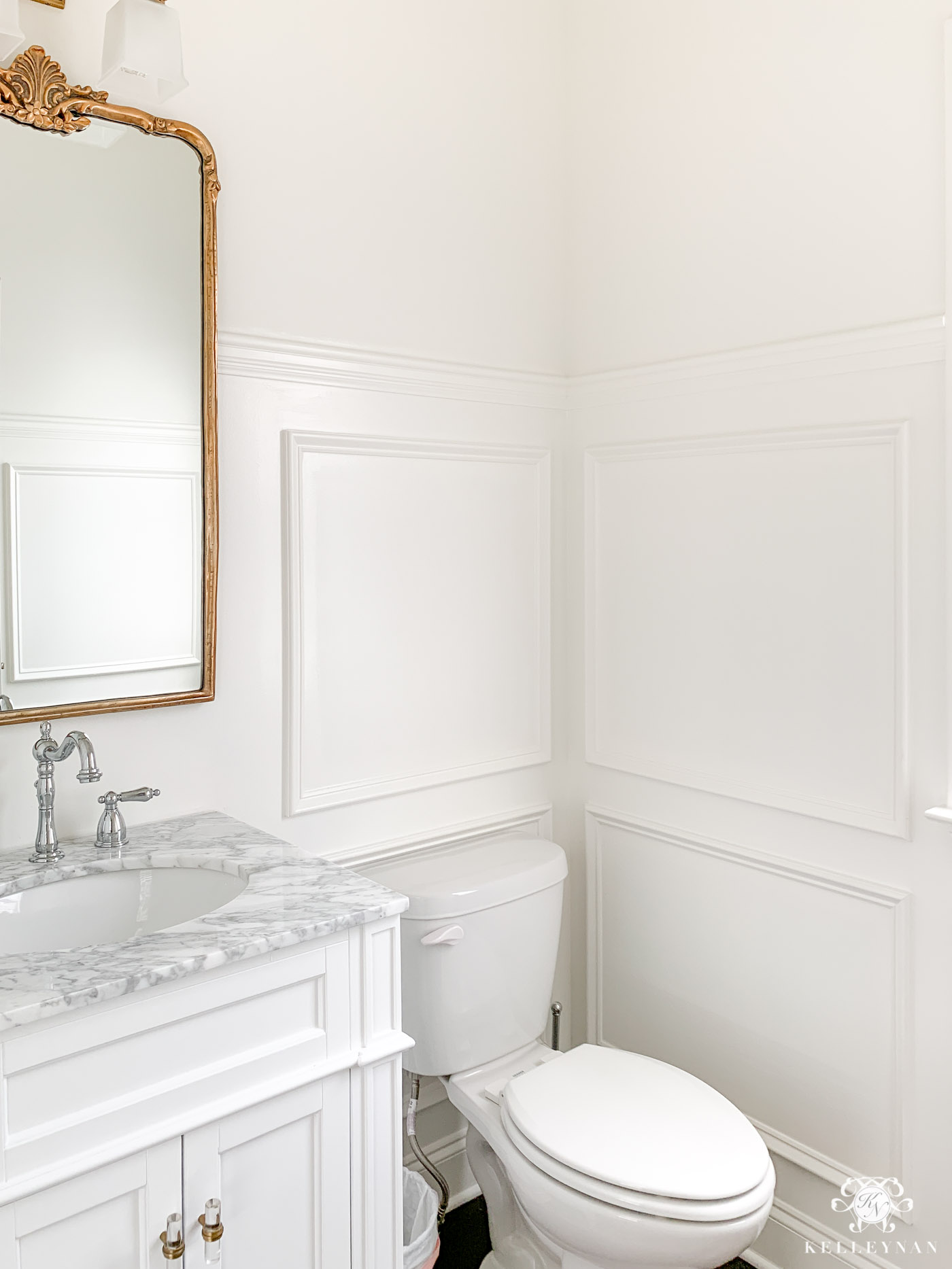
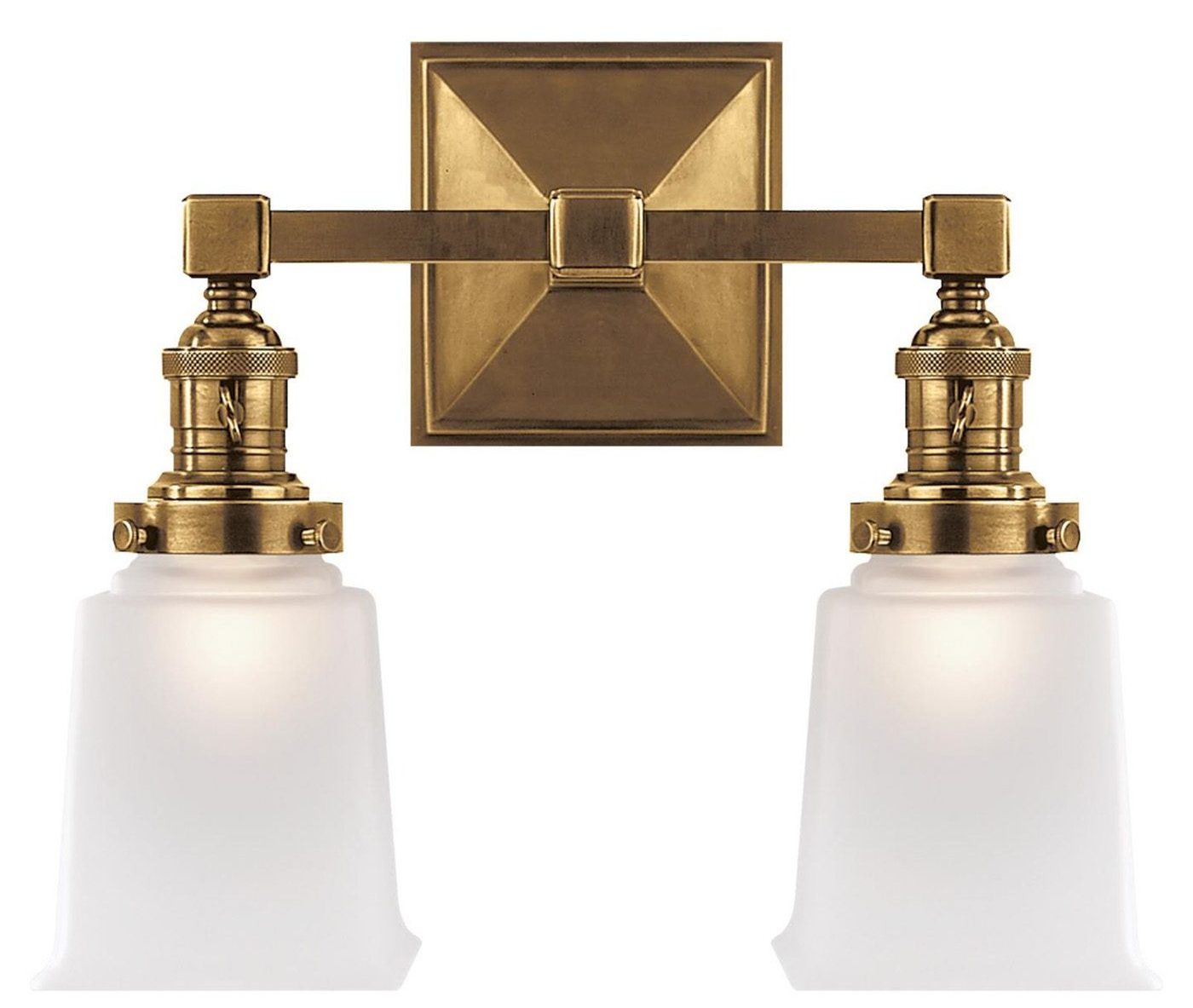
I love this light fixture, and it was a splurge (for me), for sure. Regardless of where I end up with my mirror, this fixture will definitely be staying.
I decided I needed something a little more simple and sleek — and with dimensions as closet to 24″x36″ as possible — so I ordered THIS infinity edge rectangle mirror in silver. The silver was brushed — not chrome — and I sent it back. I liked the brass option but it is actually called “copper” which made me nervous. So then, I scored a killer deal on THIS mirror; I was confident it would work and at the time, was a fantastic deal… but it was also final sale for the discounted price.
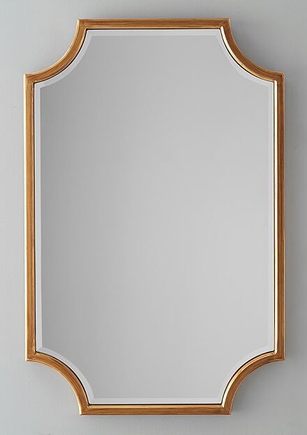
It is a beautiful mirror but the frame is a little chunkier than I was hoping for this specific space and I think I still want something a little cleaner. It’s also just a little warmer that I was hoping — it would be great on it’s own but next to the brass light fixture, just a shade off, would be tough. I haven’t actually hung it and tried it in the space — again, I’m dragging my feet because I have doubts and don’t want to face having to make a decision haha. I’m even considering THIS mirror now, depending on the outcome, in the chrome finish option but wish the frame was a little thinner. I think my next move is to go back and order the first replacement in the copper color (HERE) — which looks like a darker brass — and cross my fingers. It’s on sale right now so maybe that’s my sign haha 😉 Ok, so yeah, the mirror situation is still a major point of indecision for me. Something else I have yet to decide on? Window treatments. I do have samples I pre-selected but don’t want to even look at those until I decide on the wallpaper. Truthfully, I would love to switch the toilet but that may have to happen at a later date 😉
Botanical Wallpaper Possibilities for the Powder Room
The wallpaper! Last year, I had our carpenter add picture frame molding about 2/3 up the wall — I love this semi-inexpensive wall treatment option that I’ve also done in my master bedroom (HERE) and my nursery focal wall (HERE). Because it’s such a small space, I feel comfortable going a little more “extra” than I typically would with print. Also, I don’t have to commit to four full walls — it’s more of an upper accent that will be toned down by the white below. Because I have more freedom, my thoughts have been all. over. the. place. I’m leaning toward a large scale floral or botanical print but can’t for the life of me determine which exact direction I want to go. Here are a few favorites that I’ve been considering…
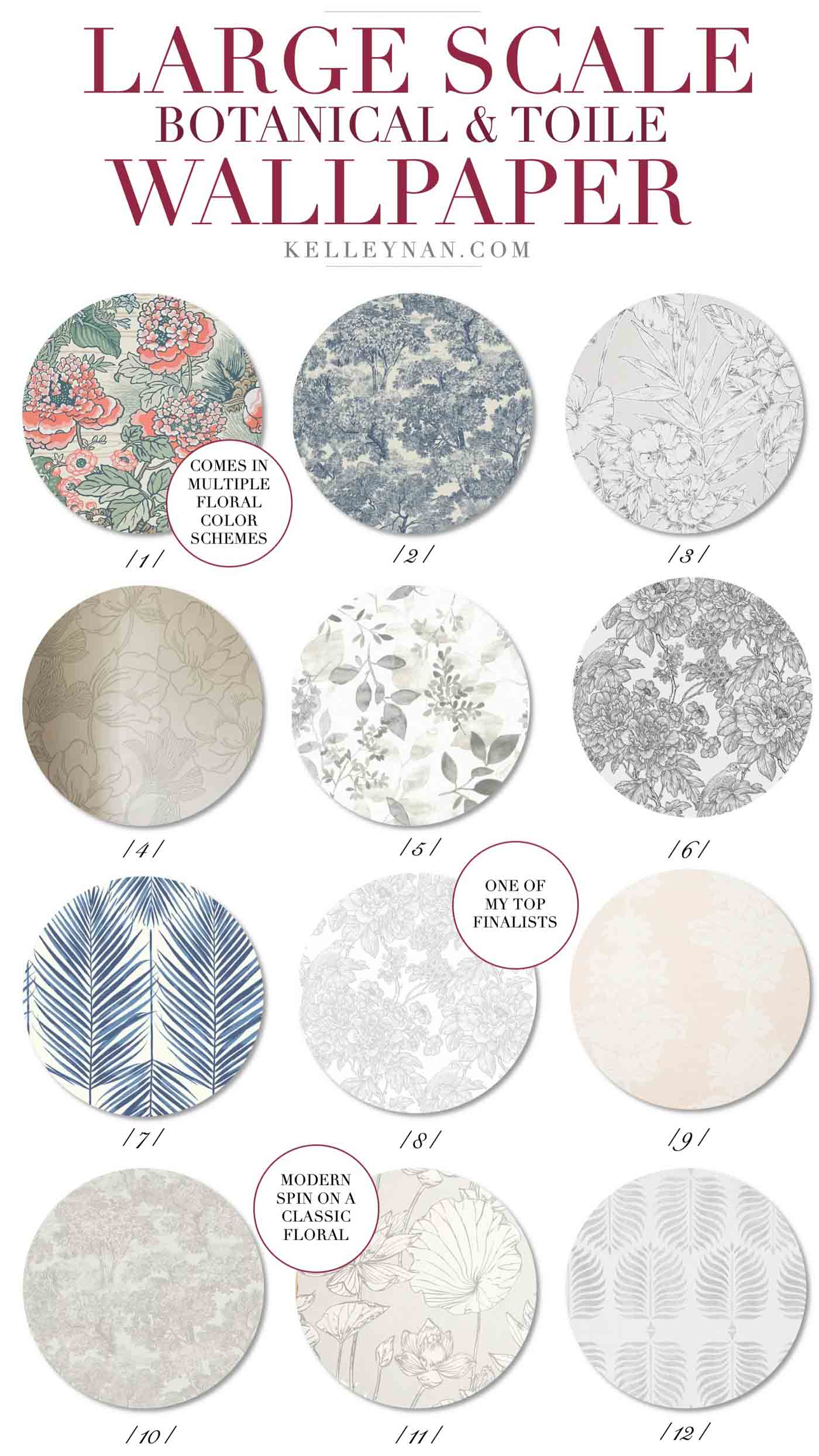
1 // 2 // 3 // 4 // 5 // 6 // 7 // 8 // 9 // 10 // 11 // 12

Number One is the boldest choice but I also think that the color combo doesn’t feel too out there. This is likely a print I wouldn’t have a chance to use in many other spaces in our home so I love the idea of going a little different and just going for it (it also comes in two other color schemes). I love the idea of going a little blue and white in this traditional toile print (Number Two) and think it would go well with some of the more traditional parts of the room (like the faucet); this also comes in a few color combos and I love the black and gray toned option, too. In the opposite direction, I am really leaning strongly toward using a busy print in grayscale and my favorites are Number Three and Number Eight. Number Six is the black and white version of Number Eight, which I also love in a major way. But then, I could totally see going a little more modern like the frond print (Number Seven) and think it could be beautiful with the mixed metals. I have changed my mind 3094 times but I think these are my top choices.
I would love to have you weigh in in the comment section at the bottom of the post (you can see larger swatches if you tap on each link). I think once I choose the wallpaper, and especially once it’s hung, the decisions (mirror, window treatments, hardware accents, etc.) will become more clear. Follow along and see what I choose and the end result of the powder room makeover by subscribing to updates at the bottom of the post!
See the completed Powder Room Reveal HERE.
Shop the Post
Scroll and tap to shop!
Other Posts You May Be Interested In
Wanting to see what happens next in the powder bath makeover? In the meantime, check out some of these related posts and room makeover reveals!


I totally LOVE number two!!! I was drawn to it right away and it would look so pretty with the white, marble and gold!
I do too! I think it goes best with my original plan… I ordered a sample this morning!
Number 11!!! I love it for this space!
I love that one! I ordered a sample today!
Definitely number 1 love the color and
the pattern!
Liz, I am totally considering it. I just ordered a sample!!
Agree!
LOVE the trim work on the walls and I’m really liking #3 or #8!!! Can’t wait to see what you decide on.
I love the number 1 in that same color way. It is a great chance to go bold and pop! My second favorite is the toile in either blue or the black/gray. I think the powder room is the place you can afford to go bold because bold has a beautiful impact in a smaller space! Love seeing all of the choices – whatever you choose will delight your heart and ours!
Lois
I like Number 10 — it’s a much softer version of number 1. Although it’s quite muted, it would still provide a break from the wainscoting.
I like number 3.
I’d choose between 1, 2, 6, and 7. I think the gray ones are too pale. A little more contrast and color would look great with the rest of your gorgeous choices, and you can get away with it in a small room like this.
9, 1, 10, in that order!
PS, I love the Artemis wallpaper in the ivory colour way showing on the shop the post. Whatever you chose it will be gorgeous!
Love #1 which give pop to your neutral home palatte. Also, like 3 and 7!
I think the scalloped mirror shown would work well with your sconce. The sconce is chunky so the mirror would be a good compliment, plus I really like the shape. The current mirror is too feminine & traditional for the above sconce.
I really like wallpaper # 3. I find busy, Lou’s wallpapers reflected in bathing mirrors make it overwhelming. Unless you plan on just wallpapering the wall where the sink & mirror are installed then a busier one would work. Having seen the rest of your house, I believe you would be happiest with a quiet, neutral wallpaper.
You asked! 😉
Number 1 for sure…small space with a bolder statement!
Love # 1 & 11, so pretty & perfect for that space
Kelley,
Love the way your powder room is coming along! We just finished a powder room makeover too, and changing the wallpaper made such a huge difference. For your room, I love 3, 5 or 11. I think they’d work beautifully with the elements that you already completed, particularly the marble counter and the brass fixture. I’d wait to decide on the mirror until you do the wallpaper first. I actually love the mirror that’s already there, even with the light fixture. Whichever way you go, I’m sure it will be gorgeous. Excited to see how you complete it.
Best,
Lory
#3 hands down. Elegant and classy.
Number 3! Absolutely #3. Love it.
My choices are 1 and 11, in that order. I like to see something with flair in a powder room so that’s why I voted for 1. It’s really such a small area it would be fun to have it pop. You have great taste and I am excited to see which one you choose.
#7 would be drop dead gorgeous!!!
Sounds like we all like something different. I vote #7.
Love number 7. I think it will really pop with your fixtures.
I love # 8………….It’s not too busy that it would take over the room.
I love #3 and #12. #3 has lots of pattern, but it’s soft and the gray outlining the flowers goes so well with the gray in the marble. #12 is more contemporary, but once again…soft, and pulls the gray from the marble. I think you could accent with almost any color you may want to use with either one of these. They will stand the test of time!
Hi Kelly Nan: My vote is for number 7! I think it provides a fun fresh, feel for the space. Your wainscoting is beautiful. Hope you are enjoying your new baby 🙂
Donna
The room is small so I think u would like 3, 8, or 12 over time. U might really get tired of the busier prints
The wallpapers are ALL beautiful choices… but I’m loving 7, 3, and 1, in that order! I think the contemporary blue frond print will elevate the bathroom, taking the bathroom from “seen-it-done-before” to “WOW”. A traditional floral print would be too expected, too ordinary.
Love both #3 & #8, but #3 is my favorite.
OMG I absolutely adore #5 – it would look so amazing with your white vanity and your choice of marble – subtle but a statement, too.
♥♥♥ it!
I like that mirror – I don’t think it’s too chunky – if it is too warm can you just spray it more of a matching color to your light fixture?
I LOVE your old mirror – where are you going to put it? It is so gorgeous.
#11 in the navy. Really special
Number 6 – classic and timeless
#7 or #3!! Both beautiful and have personality! I like #8 but think it’s too safe!
For sure, number 1. Colors are perfect for that room.
1,2,or 6! I think the busier ones stand out better in such a clean space!
I love 11. Clean, soft, sophisticated!
I like the blue and white #7. And also your original mirror!
#5, then #11! I think the colors of either one would compliment your mixed metals, as well as the marble vanity top. They are soft and muted, yet have some pattern and pop! I’m sure whatever you choose will be beautiful!
I absolutely LOVE #5!
Kelley! I saw your samples up today on IG and I LOVED #1!!!